Written by Allen Wyatt (last updated September 30, 2023)
This tip applies to Excel 2010, 2013, 2016, 2019, Excel in Microsoft 365, and 2021
Excel 2010 introduced a new feature referred to as sparklines. They are nothing more than miniature charts that can appear inside a single cell. The graphs aren't as varied and full-featured as regular Excel charts, but they are pretty cool, nonetheless. They are especially good for showing, at a glance, the general trend of the numbers in a range of cells.
To create a sparkline, follow these steps:
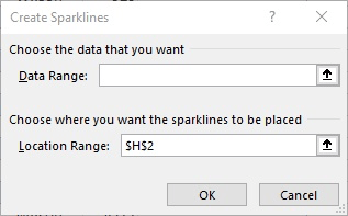
Figure 1. The Create Sparkline dialog box.
You should see your sparkline appear immediately in the cell you specified in step 1.
ExcelTips is your source for cost-effective Microsoft Excel training. This tip (12588) applies to Microsoft Excel 2010, 2013, 2016, 2019, Excel in Microsoft 365, and 2021.

Professional Development Guidance! Four world-class developers offer start-to-finish guidance for building powerful, robust, and secure applications with Excel. The authors show how to consistently make the right design decisions and make the most of Excel's powerful features. Check out Professional Excel Development today!
When formatting a chart, you select elements and then change the properties of those elements until everything looks just ...
Discover MoreWhen sending a chart to someone else, it can be frustrating for the other person to open the workbook and see errors ...
Discover MoreWhen you create a chart, Excel automatically assigns different colors to the various data series in the chart. At some ...
Discover MoreFREE SERVICE: Get tips like this every week in ExcelTips, a free productivity newsletter. Enter your address and click "Subscribe."
2023-10-04 12:54:55
Dave S
Sparklines can be useful, for the reason given above. But if the end user's requirements require more than one line (for example, to show trend relative to some target value) remember that you can create your own 'sparkline' by placing a normal chart into a cell. Create the chart, delete everything apart from the lines, then snap fit chart area to a cell and finally snap fit the plot area to the cell. As it is a real chart you can change line type, thickness and colour as required.
Got a version of Excel that uses the ribbon interface (Excel 2007 or later)? This site is for you! If you use an earlier version of Excel, visit our ExcelTips site focusing on the menu interface.
FREE SERVICE: Get tips like this every week in ExcelTips, a free productivity newsletter. Enter your address and click "Subscribe."
Copyright © 2024 Sharon Parq Associates, Inc.
Comments