Please Note: This article is written for users of the following Microsoft Excel versions: 2007, 2010, 2013, 2016, 2019, 2021, 2024, and Excel in Microsoft 365. If you are using an earlier version (Excel 2003 or earlier), this tip may not work for you. For a version of this tip written specifically for earlier versions of Excel, click here: Easily Changing Chart Data Ranges.
Written by Allen Wyatt (last updated August 30, 2025)
This tip applies to Excel 2007, 2010, 2013, 2016, 2019, 2021, 2024, and Excel in Microsoft 365
Excel is great when it comes to creating charts based on data in a data table. You can use the tools on the Insert tab of the ribbon to quickly identify an entire data table or you can select a portion of a data table and use the same tools to create a chart based just on that portion.
If you change the data range for your chart quite often, it can get tiresome to continually change the data range reference. For instance, if you have a data table that includes several years' worth of data, you may want to view a chart that is based on the first five years of data and then change the data range so the chart refers to a different subset of the data. Make the changes often enough and you'll start casting about for ways to make the changes easier (and more reliably).
One way to do this is with the use of named ranges and several worksheet functions. Let's say that your chart is embedded on a worksheet, but the worksheet is different than the one where the source data is located. On the same sheet as the chart, create two input cells which will serve as "from" and "to" indicators. Name these two cells something like FromYear and ToYear.
On your data worksheet (the one without the chart; I'll name the worksheet "Source Data"), the data is arranged with each year in a separate column and a series of cost factors in each row. Start your table in column F and place your years in row 2. Place the cost factors in column E, starting at row 3. Above the years place a capital letter that is the same as the column letter, and in column D place a number that is the same as the row number of the data. (See Figure 1.)
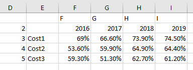
Figure 1. First phase of data preparation.
In this example, the chart that is embedded on the other worksheet is based on the data in the range F2:I5. There is nothing special about the chart, but the changes you are getting ready to make will make it dynamic, and therefore much more useful.
Still working on the "Source Data" worksheet, start by placing the following formula in cell B1:
="Trends for " & IF(FromYear=ToYear,FromYear,FromYear & " to " & ToYear)
This formula provides a dynamic title that you will later use for your chart. Give cell B1 the name addrTitle, then place the following formula in cell B2:
="'Source Data'!$" & INDEX($F$1:$I$1,1,MATCH(FromYear,$F$2:$I$2)) &
"$" & D2 & ":$" & INDEX($F$1:$I$1,1,MATCH(ToYear,$F$2:$I$2)) & "$" & D2
Remember that this is a single formula, although it is shown on two lines here for clarity. Copy the formula in B2 to the cells B3:B5. The formula returns address strings that represent the desired ranges for the X-axis values and the data series. The actual ranges returned by the formulas will vary, based on the values you enter in the FromYear and ToYear cells on the other worksheet. To make things clearer you can enter some labels into column A. (See Figure 2.)
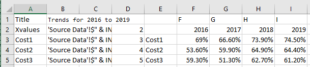
Figure 2. Second phase of data preparation.
Now you need to name each of the cells in the range B2:B5. Select B2 and in the Name Box (just above column A) enter the name "addrXVal" (without the quotes). Similarly name B3 as addrCost1, B4 as addrCost2, and B5 as addrCost3.
The next step is to create a couple of named formulas that you can use in creating the charts. Display the Formulas tab of the ribbon and click the Define Name tool to display the New Name dialog box. (See Figure 3.)
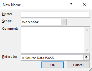
Figure 3. The New Name dialog box.
In the Name area, at the top of the dialog box, type "rngXVal" (without the quotes), then type the following in the Refers To box:
=INDIRECT(addrXVal)
Click OK and the name is defined. Then, using the same New Name dialog box, define additional names (rngCost1, rngCost2, and rngCost3) that use the same type of INDIRECT formula to refer to the ranges addrCost1, addrCost2, and addrCost3, respectively.
Now you are finally ready to update the references in your chart. Right-click the chart and choose Select Source or Select Data, depending on your version of Excel. Excel displays the Select Data Source dialog box. (See Figure 4.)
Figure 4. The Series tab of the Source Data dialog box.
For each of the data series listed at the left side of the dialog box, click the Edit button and enter the Name and Values according to the names you defined. Thus, for the Cost1 series you would enter a Name of ='Source Data'!addrCost1 and a Values of ='Source Data'!rngCost1. You would use the similar references and names for each of the other data series, as well.
Note that you must include the name of your worksheet (Source Data), within apostrophes, in the references you enter. In the Category (X) Axis Labels reference you can enter ='Source Data'!rngXVal.
Once this is done, you can change the starting and ending years in the FromYear and ToYear cells, and Excel automatically and immediately updates the chart to represent the data you specified.
For an extra touch, if you haven't already added a chart title, go ahead and do so. If you are using Excel 2007 or Excel 2010, select the chart, display the Layout tab of the ribbon, click the Chart Title tool, and choose the way you want the title to appear. The title should appear immediately in the chart.
If you are using Excel 2013 or a later version, click the Chart Elements icon, near the upper-right corner of your chart. (It looks like a plus sign.) Excel displays a "fly-out" menu that lists various elements you can add to your chart. (See Figure 5.)
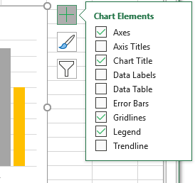
Figure 5. Adding titles to a chart in Excel in Microsoft 365.
Make sure you a check mark appears beside the Chart Title element. The title should appear immediately in the chart.
Regardless of the version of Excel you are using, click the title (within the chart itself) once to select it. You should see the selection box around the title. In the Formula bar enter the following:
='Source Data'!addrTitle
The chart title is now linked back to the cell containing the title string, which in turn is dynamically updated each time you change the FromYear and ToYear values.
ExcelTips is your source for cost-effective Microsoft Excel training. This tip (8667) applies to Microsoft Excel 2007, 2010, 2013, 2016, 2019, 2021, 2024, and Excel in Microsoft 365. You can find a version of this tip for the older menu interface of Excel here: Easily Changing Chart Data Ranges.

Excel Smarts for Beginners! Featuring the friendly and trusted For Dummies style, this popular guide shows beginners how to get up and running with Excel while also helping more experienced users get comfortable with the newest features. Check out Excel 2019 For Dummies today!
Gridlines are often added to charts to help improve the readability of the chart itself. Here's how you can control ...
Discover MoreIf you add callouts using the drawing tools in Excel, you may have noticed that they don't always stay where you expect ...
Discover MoreCreate a chart on its own worksheet, and you can display it by simply clicking the tab at the bottom of the Excel work ...
Discover MoreFREE SERVICE: Get tips like this every week in ExcelTips, a free productivity newsletter. Enter your address and click "Subscribe."
There are currently no comments for this tip. (Be the first to leave your comment—just use the simple form above!)
Got a version of Excel that uses the ribbon interface (Excel 2007 or later)? This site is for you! If you use an earlier version of Excel, visit our ExcelTips site focusing on the menu interface.
FREE SERVICE: Get tips like this every week in ExcelTips, a free productivity newsletter. Enter your address and click "Subscribe."
Copyright © 2026 Sharon Parq Associates, Inc.
 Please Note:
This article is written for users of the following Microsoft Excel versions: 2007, 2010, 2013, 2016, 2019, 2021, 2024, and Excel in Microsoft 365. If you are using an earlier version (Excel 2003 or earlier), this tip may not work for you. For a version of this tip written specifically for earlier versions of Excel, click here:
Please Note:
This article is written for users of the following Microsoft Excel versions: 2007, 2010, 2013, 2016, 2019, 2021, 2024, and Excel in Microsoft 365. If you are using an earlier version (Excel 2003 or earlier), this tip may not work for you. For a version of this tip written specifically for earlier versions of Excel, click here:
Comments