Ronald has a worksheet that shows low and high temperatures, by date, in 3 columns. He would like to chart the temperatures in a horizontal bar chart, where the bar starts at the low and extends to the high for each date. For instance, the range for temperature on one day has a low of -2 (negative 2) degrees and a high of positive 5 degrees. Therefore, the horizontal bar would start at -2 and extend to +5. For a temperature range where the low was 9 and the high was 22, the horizontal bar for that date would start at +9 and extend to +22. Ronald cannot get this type of bar chart created for some reason.
As with many things in Excel, the approach you take will depend on the data you are working with. For instance, let's say you have the temperatures (minimum and maximum) for each day in January 2023 for Knoxville, Tennessee. The lowest temperature for any date in that month is 23 and the highest is 75. (All temperatures in this tip are on the Fahrenheit scale.) This data is easy to chart, but it does require the use of a helper column.
First, about the helper column: What Ronald wants displayed is a bar that shows the temperature span between the low and high temperatures for a day. This is easily determined by subtracting the low from the high. So, this is the purpose of the helper column—to note the difference between low and high. Since you want to use this helper column in your chart, let's assume that your data starts with the date in column A, the low temperature in column B, and the high temperature in column C. Add a couple of blank columns between B and C, so that the high temperature is now in column E. In column C create your "difference" helper column. (See Figure 1.)
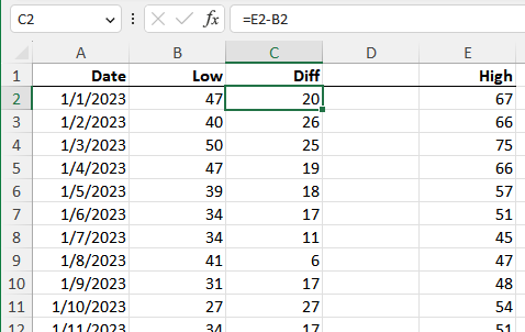
Figure 1. Getting your data ready to chart.
Now, select one of the cells in columns A, B, or C. Then, follow these steps:
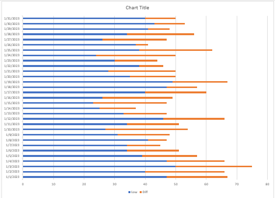
Figure 2. Your data in a stacked bar chart.
At this point, the blue bars are the minimum temperatures and the orange is the difference between the low and high. Since the data is stacked, this means that the orange starts at the low temperature for the day and ends at the high temperature for the day. This is the temperature span that Ronald needs. However, it would be beneficial to hide the blue data series (the one that represents the low temperature).
To do this, right-click on one of the blue bars and choose Format Data Series. Excel displays the Format Data Series task pane at the right of the screen. Using the controls in the task pane, set the bar fill to "No Fill" and the border to "No Line." This makes the blue data series invisible and you end up with the type of chart you wanted. (See Figure 3.)
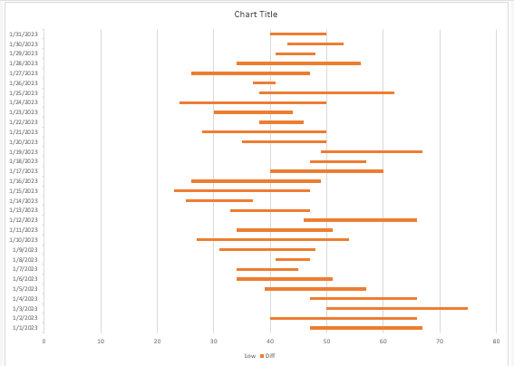
Figure 3. Showing just the temperature ranges for each day.
At this point you can do any other customizations to your data that you desire, such as changing the title and legend.
I started this tip by noting that how you approached your charting depends on your data. In the approach already discussed, the temperatures were all above 0; there were no negative temperatures. This approach won't work if there are negative temperatures because the calculated temperature differential (in the helper column) will not, when plotted in a stacked bar chart, begin at the low temperature (which may be negative) and end at the high temperature (which may also be negative).
Because of this, you'll need four helper columns to calculate the data that will finally be charted. Assuming your data is in columns A (date), B (low), and C (high), you can place these helper columns in D:G. These should have the headings NegBlank, Negative, PosBlank, and Positive. In row 2 you can place the following formulas:
D2: =IF(AND(B2<0,C2<0),C2,0)
E2: =IF(AND(B2<0,C2<0),B2-C2,IF(C2<0,0,IF(B2<0,B2,0)))
F2: =IF(AND(B2>0,C2>0),B2,0)
G2: =IF(AND(B2>0,C2>0),C2-B2,IF(C2>0,C2,0))
Copy these down as many rows as necessary and your data is now ready for charting. (See Figure 4.)
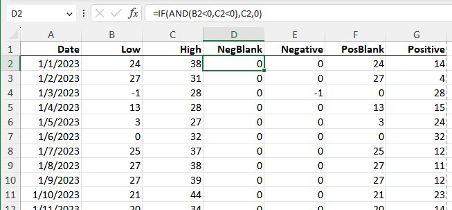
Figure 4. Your data with four helper columns.
To create the chart, follow these steps:
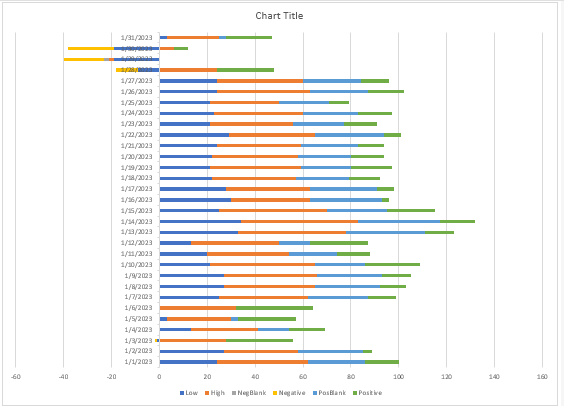
Figure 5. Your data in a stacked bar chart.
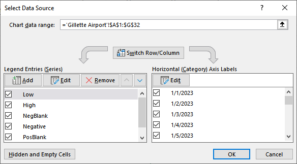
Figure 6. The Select Data Source dialog box.
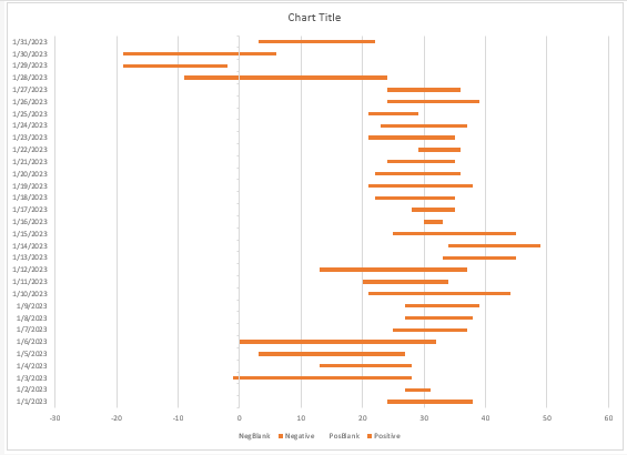
Figure 7. Your chart, mostly finished.
Your chart is basically done at this point, but you can make other formatting adjustments, as desired. (By the way, the data charted here is from actual temperatures for January 2023 for Gillette, Wyoming. As you can tell, we have rather wide swings in temperatures in our state.)
ExcelTips is your source for cost-effective Microsoft Excel training. This tip (9763) applies to Microsoft Excel 2007, 2010, 2013, 2016, 2019, 2021, and Excel in Microsoft 365.

Create Custom Apps with VBA! Discover how to extend the capabilities of Office 365 applications with VBA programming. Written in clear terms and understandable language, the book includes systematic tutorials and contains both intermediate and advanced content for experienced VB developers. Designed to be comprehensive, the book addresses not just one Office application, but the entire Office suite. Check out Mastering VBA for Microsoft Office 365 today!
If you need a number of charts in your workbook to all be the same size, it can be a bother to manually change each of ...
Discover MoreGot a bunch of charts that you need to make formatting changes in? You can use a macro (or two) to apply the formatting ...
Discover MoreWhen sending a chart to someone else, it can be frustrating for the other person to open the workbook and see errors ...
Discover MoreFREE SERVICE: Get tips like this every week in ExcelTips, a free productivity newsletter. Enter your address and click "Subscribe."
2023-04-24 04:19:48
Peter Atherton
This technique is also used to create Gantt Charts; a Project Management Tool if anyone is interested.
2023-04-23 04:19:48
Peter Atherton
Tomek
Lucid tutorials, great stuff.
Peter
2023-04-22 18:07:25
@Jack Oster
I can send you my test file if you are interested. Just send me an e-mail, or post a comment here with your email unhidden, like mine in this post.
2023-04-22 18:04:15
Tomek
I am trying to post the screenshot for my previous comment again to avoid quality degradation due to size reduction. My original was more than 600px wide, now is less. (see Figure 1 below)
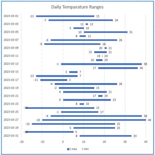
Figure 1.
2023-04-22 17:56:52
Tomek
In my solution I sent earlier, the bar representing the temperature range was invisible if both minimum and maximum temperatures were the same. The fix I suggested required adjusting the underlying data, and that bothered me as not quite right, so I was searching for another way to eliminate this deficiency. What I came up with is the following:
1. Add an error bar to the bars representing the maximum temperature. The easiest way to do this is to select the bars for maximum temperatures, then search for Error Bars in the search box on the top of Excel window, and then select Standard Error. Next, right click on one of the error bars that show up and choose Format Error Bars (you may already have the Task Pane open, which automatically adjusts when you select chart elements). I opted for the horizontal bar in the plus direction only, having a cap, Fixed error Value = 0 (sic!). For the line color you can chose a contrasting color, which will be visible at the end of each bar, or the same color as the bar, which will be essentially invisible, except where the temperature range bar is invisible. The cap of the error bar will likely be slightly narrower or wider than the graph bars, but at least you will see something indicating the temperature for the day when max=min.
2. You can make the graph easier to read, if you add data labels showing the temperatures to both maximum (to the right of the bar) and minimum (to the left of the respective bar) as you can see in the attached screenshot (see Figure 1 below) . I colored my error bars red for better clarity of the picture.
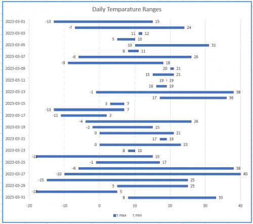
Figure 1.
2023-04-22 17:44:02
Tomek
As Allen mentioned, the first approach works when all temperatures are positive. This may be the case depending where you are, and better chance if you use Fahrenheit scale, like in the USA (or if you are a scientist and use Kelvin ;-). The second approach does work for both negative and positive temperatures but is fairly involved, and requires somewhat complicated logic for the helper columns. It also does not display anything for the days that have minimum and maximum temperatures that are equal.
I have slightly different solution that achieves the same visual effect. Instead of using stacked bars I suggest using clustered bars. They can be formatted to completely overlap, meaning that the one in front will hide part or all of the bar behind it. If you make the front bar the same colour as the background, the graph will display only the part of the second bar that is above the front one. Obviously the front one must be for the minimum temperatures.
The advantage of this approach is that if you move your vertical axis to the left edge, both bars will start at where this axis is (not at zero), hence the display will be correct for both negative and positive temperatures. This behaviour is specific to clustered-bars graph, and does not work with stacked bars.
Below is a step by step guide how to set up such graph:
For the purpose of this I will assume that you have your dates in column A, the maximum temperatures in column B, and minimums in column C. This order is important for the trick to work.
I will also assume that you have consecutive dates in ascending order (although this is not absolutely necessary if they are actual dates, i.e., serial numbers). You also have to make sure that for each date the maximum temperature is not less than minimum.
For the graph to be visually clear, I would suggest maximum of 31 dates, or a month worth of data. If you have more data you may filter them to keep the graph readable.
1. Once you have your data organized, select it (A1:C32 in my example), then chose Insert Tab - in the Chart group click on the small arrow in the lower-right corner, select All Charts, Bar, Clustered Bars and chose the first option.
2. Next, on the graph right-click on any of the bars representing minimum temperatures. Select Format Data Series.
3. In the dialog box that opens chose the icon for Series Options. Set the series overlap to 100%. This will cause the bars to align and the "minimum" bars overlap the "maximum" ones.
4. Select the "Fill & Line" icon. set the fill color for the minimum bars to solid and the same colour as the background (usually white). This will cause the positive part of the graph to look like you wanted, but the negative will be still wrong.
5. To finalize your graph, you need to move the vertical axis to the left of the graph. To do that you need to format the horizontal axis (right click on one of the temperatures on that axis and select format axis). Set the Bounds for the axis to extend beyond possible minimum and maximum temperatures. Set the Verical Axis Crosses - Axis Value to the same as the lower bound. This will cause all bars to extend from the lower bound; in effect the minimum bar will hide the portion of the maximum bar and your graph will look like you wanted.
I am attaching a screenshot of my test spreadsheet (see Figure 1 below) . For better visibility I left the minimum bars as very light gray, except for first three days; I hope this will make understanding my approach a little easier.
If you would like your days to go from top to bottom, format the vertical axis to be in revers order (in Axis Options) and move the horizontal axis to the bottom of the graph if you so desire. The screenshot shows that arrangement.
The graph has the same deficiency that the solution from the tip had: for days when the minimum and maximum temperatures were exactly the same there is nothing displayed. Check the graph for Mar.11 - there is no blue bar there. If this causes a problem, you may want to edit your data, e.g, lower the minimum or raise the maximum temperatures by some negligible amount. I found that 0.05°C worked for the graph above. I have also another solution for that, which I will post separately (this comment is already long enough.
Figure 1.
2023-04-22 15:53:57
Jack Oster
Regarding the fascinating tip re stacked bar charts, named, Creating a Bar Chart for Temperatures, could you by any chance send me the data that you used Allen. I want to see if I can achieve what you have in this tip. Thanks from Jack in Australia.
Got a version of Excel that uses the ribbon interface (Excel 2007 or later)? This site is for you! If you use an earlier version of Excel, visit our ExcelTips site focusing on the menu interface.
FREE SERVICE: Get tips like this every week in ExcelTips, a free productivity newsletter. Enter your address and click "Subscribe."
Copyright © 2026 Sharon Parq Associates, Inc.
Comments