Please Note: This article is written for users of the following Microsoft Excel versions: 2007, 2010, 2013, 2016, 2019, and 2021. If you are using an earlier version (Excel 2003 or earlier), this tip may not work for you. For a version of this tip written specifically for earlier versions of Excel, click here: Plotting Times of Day.
Richard has some source data that shows the date and time displayed in the format dd/mm/yy hh:mm, but when he creates a chart from that data, the only thing that is plotted is the date. He is wondering if there is a way of plotting the times on the chart, as well as the date.
There are several ways you can approach this issue, depending on the type of chart you want to create. If you create an X-Y scatter chart, the date and time should plot automatically. This is not the case if you choose to create a bar, column line, or any other type of chart. In those cases, the X axis is created from equally spaced values, so you won't get exactly what you want.
If you don't want to use a scatter chart, then you could simply modify the data in your source. Add a column that represents the hour of the day, derived through the HOUR function. For instance, if you have your date and time in column B, add a column C and fill it with formulas such as =HOUR(B3). The result is a bunch of numbers representing the hour of the day, 0 through 23. This can chart very easily in any manner desired.
If that doesn't fit your needs, then go ahead and create the chart as you normally would. Then, if you are using Excel 2007 or Excel 2010 right-click the X axis and choose Format Axis from the Context menu. You should see the Format Axis dialog box and choose Number at the left of the dialog box. (See Figure 1.)
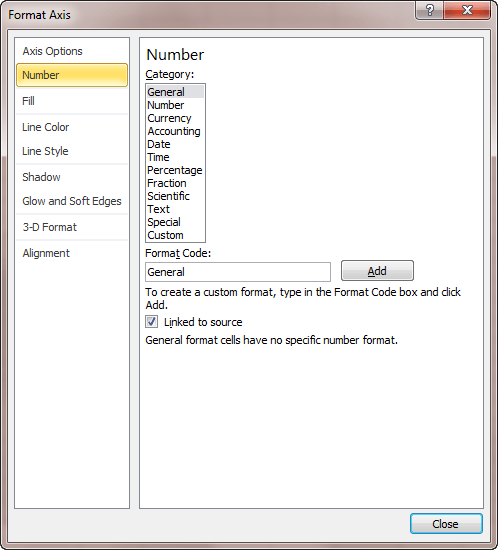
Figure 1. The number options of the Format Axis dialog box.
You can display the equivalent controls in Excel 2013 or a later version by right-clicking the axis and choosing Format Axis from the Context menu. Excel displays the Format Axis pane at the right side of the screen. The pane should already be set to Axis Options | Axis Options (sounds redundant; I know). All you need to do is expand the Number group at the bottom of the pane. (See Figure 2.)
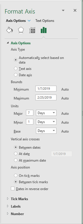
Figure 2. The Format Axis pane.
Choose one of the formats for the axis under either the Date or Time categories. You may have to play a bit with your selection, experimenting to find out what works best. Quite honestly, what works best in one situation won't necessarily work best in another because of the nature of the data being charted.
ExcelTips is your source for cost-effective Microsoft Excel training. This tip (9547) applies to Microsoft Excel 2007, 2010, 2013, 2016, 2019, and 2021. You can find a version of this tip for the older menu interface of Excel here: Plotting Times of Day.
Best-Selling VBA Tutorial for Beginners Take your Excel knowledge to the next level. With a little background in VBA programming, you can go well beyond basic spreadsheets and functions. Use macros to reduce errors, save time, and integrate with other Microsoft applications. Fully updated for the latest version of Office 365. Check out Microsoft 365 Excel VBA Programming For Dummies today!
When you create a chart, you specify an initial data range. If you later add columns to your data, you may not want the ...
Discover MoreCreating a graphic chart based on your worksheet data is easy. This tip provides a couple of different ways you can start ...
Discover MoreNeed to generate a chart in the fastest possible way? Just use this shortcut key and you'll have one faster than you can ...
Discover MoreFREE SERVICE: Get tips like this every week in ExcelTips, a free productivity newsletter. Enter your address and click "Subscribe."
There are currently no comments for this tip. (Be the first to leave your comment—just use the simple form above!)
Got a version of Excel that uses the ribbon interface (Excel 2007 or later)? This site is for you! If you use an earlier version of Excel, visit our ExcelTips site focusing on the menu interface.
FREE SERVICE: Get tips like this every week in ExcelTips, a free productivity newsletter. Enter your address and click "Subscribe."
Copyright © 2026 Sharon Parq Associates, Inc.
 Please Note:
This article is written for users of the following Microsoft Excel versions: 2007, 2010, 2013, 2016, 2019, and 2021. If you are using an earlier version (Excel 2003 or earlier), this tip may not work for you. For a version of this tip written specifically for earlier versions of Excel, click here:
Please Note:
This article is written for users of the following Microsoft Excel versions: 2007, 2010, 2013, 2016, 2019, and 2021. If you are using an earlier version (Excel 2003 or earlier), this tip may not work for you. For a version of this tip written specifically for earlier versions of Excel, click here:
Comments