Please Note: This article is written for users of the following Microsoft Excel versions: 2007, 2010, 2013, 2016, 2019, Excel in Microsoft 365, and 2021. If you are using an earlier version (Excel 2003 or earlier), this tip may not work for you. For a version of this tip written specifically for earlier versions of Excel, click here: Colorizing Charts.
Written by Allen Wyatt (last updated May 20, 2023)
This tip applies to Excel 2007, 2010, 2013, 2016, 2019, Excel in Microsoft 365, and 2021
If you have a pie chart with a large number of sections, getting unique colors for each section might be a problem. Or, perhaps your printer doesn't print colors exactly as they are on your screen so some colors which appear quite distinct on the screen will print out nearly the same on paper.
Don't despair—you can change the color of any individual section of a pie chart, or any other type of chart for that matter. For pie charts, follow these steps if you are using Excel 2007 or Excel 2010:
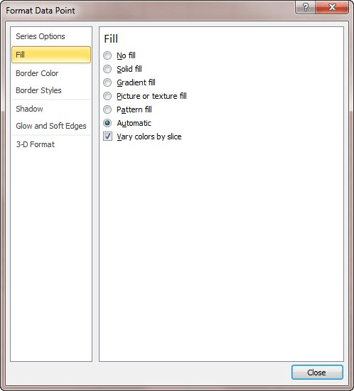
Figure 1. The Fill options of the Format Data Point dialog box.
The process is much easier if you are using Excel 2013 or a later version:
Regardless of the version of Excel you are using, these steps can be easily adapted to any type of chart. The only difference is that you select the chart object (bar, point, what have you) in the first two steps instead of the pie section.
When I make a chart, I also like to apply this same process to chart titles. I like them to be the same color as the information in the chart to which they apply. This makes identification even clearer.
ExcelTips is your source for cost-effective Microsoft Excel training. This tip (6295) applies to Microsoft Excel 2007, 2010, 2013, 2016, 2019, Excel in Microsoft 365, and 2021. You can find a version of this tip for the older menu interface of Excel here: Colorizing Charts.

Excel Smarts for Beginners! Featuring the friendly and trusted For Dummies style, this popular guide shows beginners how to get up and running with Excel while also helping more experienced users get comfortable with the newest features. Check out Excel 2013 For Dummies today!
Excel allows you to create custom chart formats that go beyond the standard formats provided in the program. These custom ...
Discover MoreExcel can display both values and names for data points in a chart, when you hover the mouse over the data point. This ...
Discover MoreWhen you create a chart, Excel automatically assigns different colors to the various data series in the chart. At some ...
Discover MoreFREE SERVICE: Get tips like this every week in ExcelTips, a free productivity newsletter. Enter your address and click "Subscribe."
There are currently no comments for this tip. (Be the first to leave your comment—just use the simple form above!)
Got a version of Excel that uses the ribbon interface (Excel 2007 or later)? This site is for you! If you use an earlier version of Excel, visit our ExcelTips site focusing on the menu interface.
FREE SERVICE: Get tips like this every week in ExcelTips, a free productivity newsletter. Enter your address and click "Subscribe."
Copyright © 2024 Sharon Parq Associates, Inc.
 Please Note:
This article is written for users of the following Microsoft Excel versions: 2007, 2010, 2013, 2016, 2019, Excel in Microsoft 365, and 2021. If you are using an earlier version (Excel 2003 or earlier), this tip may not work for you. For a version of this tip written specifically for earlier versions of Excel, click here:
Please Note:
This article is written for users of the following Microsoft Excel versions: 2007, 2010, 2013, 2016, 2019, Excel in Microsoft 365, and 2021. If you are using an earlier version (Excel 2003 or earlier), this tip may not work for you. For a version of this tip written specifically for earlier versions of Excel, click here:
Comments