Enno works regularly with X-Y charts. He can hover the mouse pointer over a data point on the chart and see the X-Y values. In his older version of Excel (2003) this worked unfailingly. In Microsoft 365 the values do not show reliably for Enno. Sometimes they do, but most often nothing shows. Other times he has to click somewhere around the data point to see the values. Enno wonders if there is some setting that will show the X-Y values more reliably.
In order to assure that Excel will display values when you use the mouse to point at the data points, you need to turn on a couple of settings. Display the Excel Options dialog box by displaying the File tab of the ribbon and clicking Options. (If you are using Excel 2007, click the Office button and then click Excel Options.) At the left side of the dialog box click Advanced, and then scroll down until you can see the Chart options. (See Figure 1.)
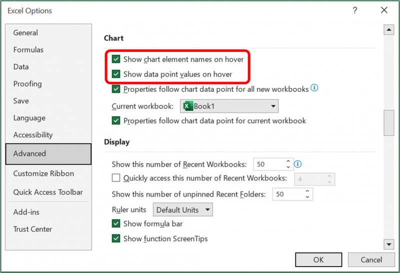
Figure 1. The Chart options in the Excel Options dialog box.
It is the first two options that you want to pay attention to. One controls the display of names and the other controls the display of values. Make sure the options are selected, as desired. When you click OK, you should then be able to hover over a data point and see the requested information.
If, however, you cannot see the values reliably, then you may want to adjust the settings so that only the second option ("Show data point values on hover") is selected. If they are still not visible reliably when you hover, it could be that your chart a large number of data points being plotted. In that case, Excel may not be able to reliably determine which data point you are hovering over with the mouse pointer.
If you find that the settings in the Excel Options dialog box are getting cleared for some reason, then you may want to use a macro to turn them on. This short macro will do the trick:
Sub ShowChartTipValues()
    Application.ShowChartTipValues = True
End Sub
You could also use a macro to toggle the value on and off, as shown here:
Sub ToggleChartTipValues()
    Application.ShowChartTipValues = (Not .ShowChartTipValues)
End Sub
If you want to affect the display of data point names, you can do so by changing the .ShowChartTipValues property to .ShowChartTipNames.
Note:
ExcelTips is your source for cost-effective Microsoft Excel training. This tip (693) applies to Microsoft Excel 2007, 2010, 2013, 2016, 2019, 2021, and Excel in Microsoft 365.
Program Successfully in Excel! This guide will provide you with all the information you need to automate any task in Excel and save time and effort. Learn how to extend Excel's functionality with VBA to create solutions not possible with the standard features. Includes latest information for Excel 2024 and Microsoft 365. Check out Mastering Excel VBA Programming today!
If you need to create a chart that uses logarithmic values on both axes, it can be confusing how to get what you want. ...
Discover MoreFiguring out how to get the data points in an X-Y scatter plot labeled can be confusing; Excel certainly doesn't make it ...
Discover MoreIf the data you are using as the source for a chart includes some cells that are empty, you may want to exclude those ...
Discover MoreFREE SERVICE: Get tips like this every week in ExcelTips, a free productivity newsletter. Enter your address and click "Subscribe."
2023-11-04 10:11:35
J. Woolley
There is an error in the Tip's second macro. It should be:
Sub ToggleChartTipValues()
Application.ShowChartTipValues = (Not Application.ShowChartTipValues)
End Sub
Got a version of Excel that uses the ribbon interface (Excel 2007 or later)? This site is for you! If you use an earlier version of Excel, visit our ExcelTips site focusing on the menu interface.
FREE SERVICE: Get tips like this every week in ExcelTips, a free productivity newsletter. Enter your address and click "Subscribe."
Copyright © 2026 Sharon Parq Associates, Inc.
Comments