Please Note: This article is written for users of the following Microsoft Excel versions: 2007, 2010, 2013, 2016, 2019, and 2021. If you are using an earlier version (Excel 2003 or earlier), this tip may not work for you. For a version of this tip written specifically for earlier versions of Excel, click here: Modifying Axis Scale Labels.
It is very common for charts to use some sort of "shorthand" for values placed along an axis. For instance, if the values along an axis ranged from 0 to 80,000, you may want to have only the thousands portion of each value displayed on the axis. That way, instead of 20,000, 40,000, 60,000, and 80,000, you would see 20, 40, 60, and 80 along the axis. A note could then be made in a label that indicates the axis values are displayed in thousands.
You can very easily change the axis scale by simply modifying how the values on the axis are displayed. Follow these steps:
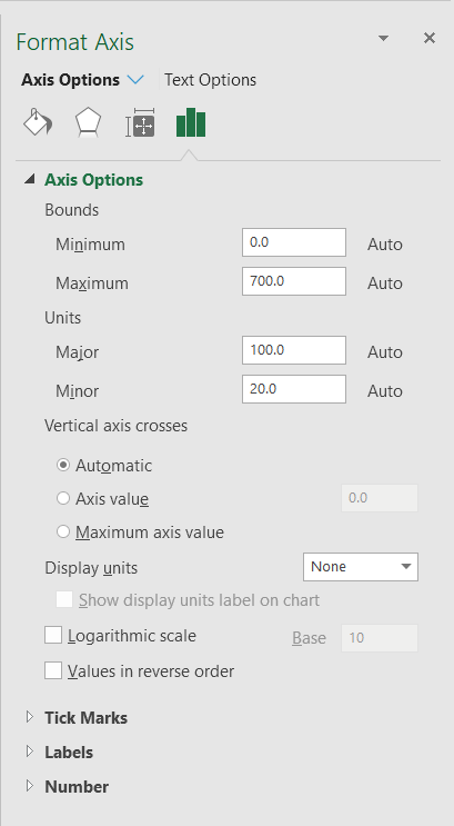
Figure 1. The Format Axis pane.
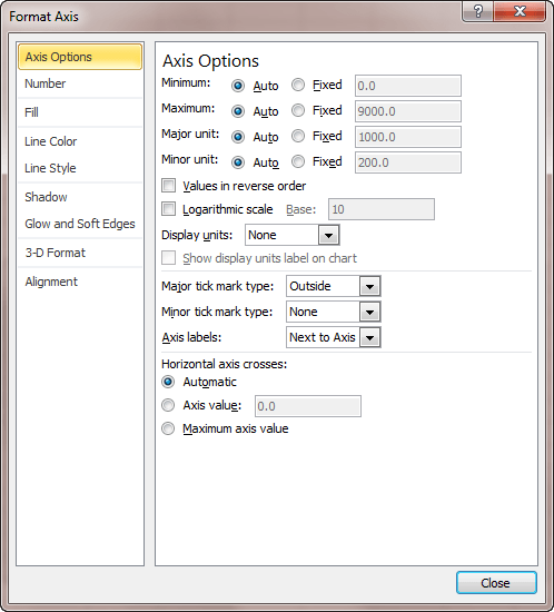
Figure 2. The Axis Options tab of the Format Axis dialog box.
Excel changes the axis values so only the thousands portion is displayed and inserts a label saying Thousands. Double-click on the Thousands label to edit the label, as desired, then drag it to any desired position.
ExcelTips is your source for cost-effective Microsoft Excel training. This tip (9485) applies to Microsoft Excel 2007, 2010, 2013, 2016, 2019, and 2021. You can find a version of this tip for the older menu interface of Excel here: Modifying Axis Scale Labels.
Best-Selling VBA Tutorial for Beginners Take your Excel knowledge to the next level. With a little background in VBA programming, you can go well beyond basic spreadsheets and functions. Use macros to reduce errors, save time, and integrate with other Microsoft applications. Fully updated for the latest version of Office 365. Check out Microsoft 365 Excel VBA Programming For Dummies today!
Pie charts are a great way to graphically display some types of data. Displaying negative values is not so great in pie ...
Discover MoreIf the data you are using as the source for a chart includes some cells that are empty, you may want to exclude those ...
Discover MoreWhen sending a chart to someone else, it can be frustrating for the other person to open the workbook and see errors ...
Discover MoreFREE SERVICE: Get tips like this every week in ExcelTips, a free productivity newsletter. Enter your address and click "Subscribe."
There are currently no comments for this tip. (Be the first to leave your comment—just use the simple form above!)
Got a version of Excel that uses the ribbon interface (Excel 2007 or later)? This site is for you! If you use an earlier version of Excel, visit our ExcelTips site focusing on the menu interface.
FREE SERVICE: Get tips like this every week in ExcelTips, a free productivity newsletter. Enter your address and click "Subscribe."
Copyright © 2026 Sharon Parq Associates, Inc.
 Please Note:
This article is written for users of the following Microsoft Excel versions: 2007, 2010, 2013, 2016, 2019, and 2021. If you are using an earlier version (Excel 2003 or earlier), this tip may not work for you. For a version of this tip written specifically for earlier versions of Excel, click here:
Please Note:
This article is written for users of the following Microsoft Excel versions: 2007, 2010, 2013, 2016, 2019, and 2021. If you are using an earlier version (Excel 2003 or earlier), this tip may not work for you. For a version of this tip written specifically for earlier versions of Excel, click here:
Comments