Please Note: This article is written for users of the following Microsoft Excel versions: 2007, 2010, 2013, 2016, 2019, 2021, and Excel in Microsoft 365. If you are using an earlier version (Excel 2003 or earlier), this tip may not work for you. For a version of this tip written specifically for earlier versions of Excel, click here: Reading Values from Graphs.
When creating charts from Excel data, you can smooth out the lines between data points by using any number of methods. At some point, you may want to actually figure out how Excel does its calculations to determine where to actually plot points along the line. Rather than visually trying to figure out where a point falls,
If you are using Excel 2013 or a later version, follow these steps:
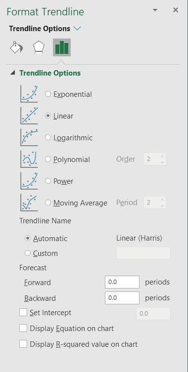
Figure 1. The Format Trendline task pane.
If you are using Excel 2007 or Excel 2010, the steps are different only in that Excel uses a dialog box instead of a task pane:
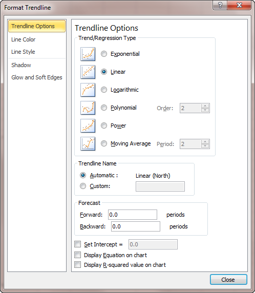
Figure 2. The Format Trendline dialog box.
The result is that Excel shows a formula, on the chart, that represents how it calculated each point along the line. You can then use this formula to determine points, as well. No more guessing! Once you know the formula, you can turn off the formula display if you want it off.
If you would like to know the different formulas that Excel uses for different types of trend lines, you can use the online Help system to search for "equations for calculating trendlines."
ExcelTips is your source for cost-effective Microsoft Excel training. This tip (10698) applies to Microsoft Excel 2007, 2010, 2013, 2016, 2019, 2021, and Excel in Microsoft 365. You can find a version of this tip for the older menu interface of Excel here: Reading Values from Graphs.

Professional Development Guidance! Four world-class developers offer start-to-finish guidance for building powerful, robust, and secure applications with Excel. The authors show how to consistently make the right design decisions and make the most of Excel's powerful features. Check out Professional Excel Development today!
Excel provides a wide variety of chart types you can use with your data. Unfortunately, this variety can often make it ...
Discover MoreWouldn't it be great to have your huge charts print out on multiple pieces of paper that you could then piece together? ...
Discover MoreWorking with elapsed times can be a bit tricky in some situations. One such situation involves the displaying of elapsed ...
Discover MoreFREE SERVICE: Get tips like this every week in ExcelTips, a free productivity newsletter. Enter your address and click "Subscribe."
There are currently no comments for this tip. (Be the first to leave your comment—just use the simple form above!)
Got a version of Excel that uses the ribbon interface (Excel 2007 or later)? This site is for you! If you use an earlier version of Excel, visit our ExcelTips site focusing on the menu interface.
FREE SERVICE: Get tips like this every week in ExcelTips, a free productivity newsletter. Enter your address and click "Subscribe."
Copyright © 2026 Sharon Parq Associates, Inc.
 Please Note:
This article is written for users of the following Microsoft Excel versions: 2007, 2010, 2013, 2016, 2019, 2021, and Excel in Microsoft 365. If you are using an earlier version (Excel 2003 or earlier), this tip may not work for you. For a version of this tip written specifically for earlier versions of Excel, click here:
Please Note:
This article is written for users of the following Microsoft Excel versions: 2007, 2010, 2013, 2016, 2019, 2021, and Excel in Microsoft 365. If you are using an earlier version (Excel 2003 or earlier), this tip may not work for you. For a version of this tip written specifically for earlier versions of Excel, click here:
Comments