Please Note: This article is written for users of the following Microsoft Excel versions: 2007, 2010, 2013, 2016, 2019, and 2021. If you are using an earlier version (Excel 2003 or earlier), this tip may not work for you. For a version of this tip written specifically for earlier versions of Excel, click here: Using Graphics to Represent Data Series.
Excel is great at creating all sorts of charts from your data. You can even customize the charts to your heart's content. One of the customizations you can make is to replace the regular bars (in a bar chart) with your own graphics. For instance, you might have a small graphic of a house that you want to use for the bars. This could be great if you wanted to use "stacked" houses to represent, for instance, housing starts in an area.
To use your own graphics in place of Excel's built-in bars, follow these steps if you're using Excel 2007 or Excel 2010:
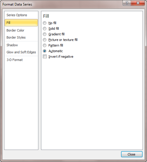
Figure 1. The Fill options of the Format Data Series dialog box.
If you are using Excel 2013 or a later version, the steps are a bit different because Microsoft did away with the Format Data Series dialog box and replaced it with a task pane. Here are the steps:
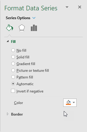
Figure 2. The Fill options of the Format Data Series dialog box.
ExcelTips is your source for cost-effective Microsoft Excel training. This tip (6156) applies to Microsoft Excel 2007, 2010, 2013, 2016, 2019, and 2021. You can find a version of this tip for the older menu interface of Excel here: Using Graphics to Represent Data Series.
Program Successfully in Excel! This guide will provide you with all the information you need to automate any task in Excel and save time and effort. Learn how to extend Excel's functionality with VBA to create solutions not possible with the standard features. Includes latest information for Excel 2024 and Microsoft 365. Check out Mastering Excel VBA Programming today!
When formatting a chart, you select elements and then change the properties of those elements until everything looks just ...
Discover MoreCreate a chart on its own worksheet, and you can display it by simply clicking the tab at the bottom of the Excel work ...
Discover MoreUnhappy with the default size that Excel uses for embedded chart objects? You can't change the size at which they are ...
Discover MoreFREE SERVICE: Get tips like this every week in ExcelTips, a free productivity newsletter. Enter your address and click "Subscribe."
There are currently no comments for this tip. (Be the first to leave your comment—just use the simple form above!)
Got a version of Excel that uses the ribbon interface (Excel 2007 or later)? This site is for you! If you use an earlier version of Excel, visit our ExcelTips site focusing on the menu interface.
FREE SERVICE: Get tips like this every week in ExcelTips, a free productivity newsletter. Enter your address and click "Subscribe."
Copyright © 2026 Sharon Parq Associates, Inc.
 Please Note:
This article is written for users of the following Microsoft Excel versions: 2007, 2010, 2013, 2016, 2019, and 2021. If you are using an earlier version (Excel 2003 or earlier), this tip may not work for you. For a version of this tip written specifically for earlier versions of Excel, click here:
Please Note:
This article is written for users of the following Microsoft Excel versions: 2007, 2010, 2013, 2016, 2019, and 2021. If you are using an earlier version (Excel 2003 or earlier), this tip may not work for you. For a version of this tip written specifically for earlier versions of Excel, click here:
Comments