When Bruce copies a chart from one workbook to another, the dates on the X axis get transformed to five-digit numbers, typically starting with 4. This is a recent issue for Bruce, and he needs to know how to correct it.
There are a few ways you can approach this issue. First, the five-digit numbers (starting with 4) are date serial numbers. They are the numeric values maintained by Excel, internally, to represent dates. Each of those numbers represents the number of days since January 1, 1900. The fact that it is a five-digit number starting with 4 means that the dates are later than July 6, 2009.
The fact that you aren't seeing dates means that your axis values have lost their formatting. You can, if desired, right-click on the axis and choose to format it. Set the format to whatever date format you want, and you should be good to go.
I said "should be" because the problem could be a bit more involved than that. To illustrate, let's say that you create a workbook called Source.xlsx. In this, you have your data and you create an embedded chart based on that data. The chart has a series of dates along the X axis. (See Figure 1.)
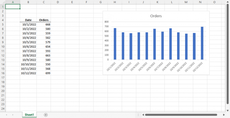
Figure 1. Your data and the chart created from the data.
Now you create another workbook, this one called Target.xlsx. You copy the chart from Source.xlsx and paste it twice into Target.xlsx. (See Figure 2.)
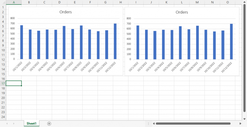
Figure 2. Two copies of the chart pasted into the Target.xlsx workbook.
At this point, everything looks fine—the dates look just as expected on the X axis. Before doing anything else, though, select the X axis on the rightmost copy of the chart. Right-click the selected axis and choose Format Axis from the Context menu, and Excel displays the Format Axis task pane at the right side of the screen. (See Figure 3.)
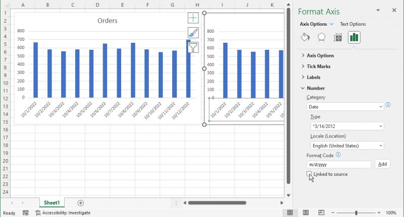
Figure 3. Formatting the X axis.
At the very bottom of the options, you want to clear the Linked to Source check box and then close the task pane. Since this check box is selected, by default, when you paste the chart, you now have one copy of the chart (the left one) that has the option selected and one copy (the right one) that has it cleared.
Now close the Source.xlsx workbook but leave Target.xlsx open. Press F9 to recalculate the workbook, and all of a sudden you'll see that the left copy of the chart now shows the dates in their unformatted condition, just as Bruce was seeing. (See Figure 4.)
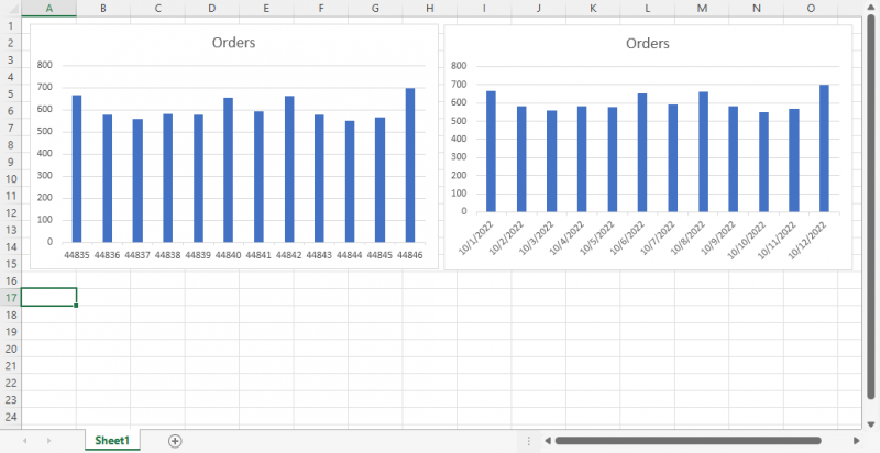
Figure 4. Unformatted dates in the left chart.
Interestingly, if you once again open the Source.xlsx workbook, then the dates will again be formatted correctly, automatically. That is because the formatting in the left chart is still linked to the chart in the Source.xlsx workbook.
So, the bottom line is that if you won't always have the source of the chart open while you are working with the target workbook, you'll want to change the format of the X axis (or any axis that contains dates) so that the Linked to Source check box is cleared.
ExcelTips is your source for cost-effective Microsoft Excel training. This tip (10251) applies to Microsoft Excel 2007, 2010, 2013, 2016, 2019, 2021, and Excel in Microsoft 365.

Excel Smarts for Beginners! Featuring the friendly and trusted For Dummies style, this popular guide shows beginners how to get up and running with Excel while also helping more experienced users get comfortable with the newest features. Check out Excel 2019 For Dummies today!
When formatting a chart, you select elements and then change the properties of those elements until everything looks just ...
Discover MoreCharts can either be embedded in a worksheet or take up an entire sheet by themselves. Changing from one type of chart to ...
Discover MoreExcel is a whiz at creating charts from your worksheet data. When the program tries to determine what should be included ...
Discover MoreFREE SERVICE: Get tips like this every week in ExcelTips, a free productivity newsletter. Enter your address and click "Subscribe."
2025-01-23 07:07:14
BG
Thanks. This worked well for the X axis.
However, the legend format couldn't be fixed this way. The legend which was a percentage lost it's formatting and was displaying as a fraction.
i.e. 0.75 instead of 75%
Going further with your fix for the X-axis, I broke the link to the source chart completely (via the Data > Workbook links option). I don't need to update the chart, so that's ok, but is there a better way to do this?
I'm using Office 365
Got a version of Excel that uses the ribbon interface (Excel 2007 or later)? This site is for you! If you use an earlier version of Excel, visit our ExcelTips site focusing on the menu interface.
FREE SERVICE: Get tips like this every week in ExcelTips, a free productivity newsletter. Enter your address and click "Subscribe."
Copyright © 2026 Sharon Parq Associates, Inc.
Comments