Jos has a worksheet that has a table showing data for each month of the year. Data is entered in the table as the year progresses, so later months in the year may not show any data. He creates a chart based on the entire table, and Excel charts the empty months as zero values. Jos wonders if there is a way to get Excel to simply ignore or (better still) not chart the empty months as zeros.
There are two easy ways you can deal with this issue. The first involves specifying what Excel does with empty cells in the source data. This was actually covered in this ExcelTip: Controlling the Plotting of Empty Cells.
There is an even easier way to get what you want, and it is especially handy for the situation that Jos is facing. The data that Jos is charting is relatively straightforward, with information in the table being filled from left to right. (See Figure 1.)
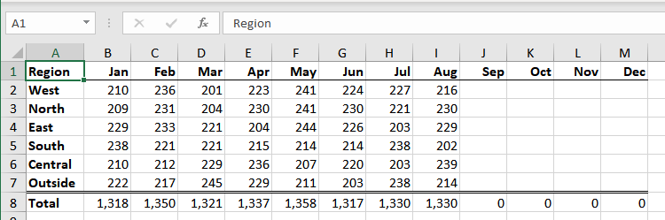
Figure 1. Sample data to be plotted.
It doesn't really matter if this data is put together with formulas or with static values. If you don't want the empty columns (September through December) to show up in your chart, just select those columns and hide them. Excel immediately redraws the chart to exclude those columns. When you are ready to fill in the data for a given month, just unhide that column and enter the data. Excel redraws the chart to include just the visible months.
ExcelTips is your source for cost-effective Microsoft Excel training. This tip (13784) applies to Microsoft Excel 2007, 2010, 2013, 2016, 2019, and 2021.

Dive Deep into Macros! Make Excel do things you thought were impossible, discover techniques you won't find anywhere else, and create powerful automated reports. Bill Jelen and Tracy Syrstad help you instantly visualize information to make it actionable. You�ll find step-by-step instructions, real-world case studies, and 50 workbooks packed with examples and solutions. Check out Microsoft Excel 2019 VBA and Macros today!
Want a handy way to make the data ranges for your chart more dynamic? Here are some great ideas you can put to work right ...
Discover MoreNeed a chart that uses two lines for axis labels? It's easy to do if you know how to set up your data in the worksheet, ...
Discover MoreWhen creating a chart, you may want to adjust the default scaling that Excel applies to an axis. This is relatively easy ...
Discover MoreFREE SERVICE: Get tips like this every week in ExcelTips, a free productivity newsletter. Enter your address and click "Subscribe."
There are currently no comments for this tip. (Be the first to leave your comment—just use the simple form above!)
Got a version of Excel that uses the ribbon interface (Excel 2007 or later)? This site is for you! If you use an earlier version of Excel, visit our ExcelTips site focusing on the menu interface.
FREE SERVICE: Get tips like this every week in ExcelTips, a free productivity newsletter. Enter your address and click "Subscribe."
Copyright © 2026 Sharon Parq Associates, Inc.
Comments