Trevor has a bar chart that he created. The labels on the Y-axis contain the names of European countries, but the label width isn't wide enough. Even if Trevor changes the font size, the labels will only show 7-9 characters. He wonders if there is a way to make the labels wider.
This problem may actually be an issue related to the version of Excel you are using or, possibly, the version of Excel used to create the workbook. In the newest versions of Excel—specifically, the version with Office 365—Excel adjusts the width of the Y-axis labels just fine when you create your bar chart. (Note that in Excel, a bar chart has the bars extending from left to right, horizontally. If they go vertically, from bottom to top, then that is a column chart. Trevor is asking, specifically, about Y-axis label widths in bar charts.) (See Figure 1.)

Figure 1. A bar chart with wide Y-axis labels.
The width adjustment is done to allow the full display of the longest text, up to about 69 characters on a sheet-size chart. (This number of characters may vary based on the version of Excel and page layout.) When it comes to embedded charts, the width displayed depends on the width of the embedded chart. On a high-resolution monitor, I got the width to be about 80 characters by making the workbook window quite wide and then the embedded chart to be a sizeable portion of that workbook's horizontal area.
It is interesting to note that in all instances of my testing, if the Y-axis label contained no spaces, when it got too wide, Excel simply hid the entire label. If the label contained spaces, then Excel would try to fit everything it could up to a space, and then display ellipses (...) from that point.
It should also be noted that if there are too many labels to display along the allotted Y-axis space, then Excel will only display a subset of the labels, such as every other label, every third label, every fourth label, or so on.
As far as manually adjusting the width for the Y-axis labels, we could find no way to do this. Clicking and trying to drag on the sides or corners of the label area does nothing. Plus, if you attempt to format the labels in the Format Axis pane, there is no setting for the label area width. The only way I could affect Y-axis width was to make the overall chart wider or narrower, and Excel would redraw the labels.
With regard to Trevor's issue, note that the screen shot included with this tip shows the European countries along the Y axis, and the longest of those is "Bosnia and Herzegovina" (22 characters). If additional text is being added that makes the label much longer, it may be truncated, again depending on your Excel version and the horizontal size of the chart.
ExcelTips is your source for cost-effective Microsoft Excel training. This tip (8156) applies to Microsoft Excel 2007, 2010, 2013, 2016, 2019, and 2021.

Excel Smarts for Beginners! Featuring the friendly and trusted For Dummies style, this popular guide shows beginners how to get up and running with Excel while also helping more experienced users get comfortable with the newest features. Check out Excel 2019 For Dummies today!
Macros allow you to make changes to virtually anything you can see in Excel. This tip examines how to make changes (even ...
Discover MoreWant to change an existing bar chart to a different type of chart, such as a line chart or a column chart? It's easy to ...
Discover MoreWant a handy way to make the data ranges for your chart more dynamic? Here are some great ideas you can put to work right ...
Discover MoreFREE SERVICE: Get tips like this every week in ExcelTips, a free productivity newsletter. Enter your address and click "Subscribe."
2022-11-15 04:29:41
shrenuj
reducing the font size might work
2020-09-21 11:09:43
Dave Bonin
I recently had a similar issue (Excel 2010) where I wanted to do more complex Y-axis category labels and formats. I believe I also had a varying number of categories which changed as the data changed over time, and I didn't want any blank bars.
My workaround was to not have the chart display the Y-axis category labels.
Instead, I made the chart area transparent and used the cells underneath the chart to display the labels. One row for each label and the plot area was just tall enough to cover them all. I had some extra blank rows which I hid or unhid depending on how many categories the chart had at the moment.
2020-09-21 09:59:10
Rkeev
Hide the Y axis, Use a dummy column of data and instead of the value for the data label use the values from another cell (aka the countries name).
2020-09-20 18:50:57
Erik
If you cannot use Jens' excellent suggestion for some reason, I have had success with legends inside an embedded chart by iteratively adjusting the chart's widths. Alternate between interior graph widths and overall exterior widths, using both left and right handles, back and forth between wider and narrower. This can result in larger axis labels than originally available in the graph with the same exterior dimensions.
(see Figure 1 below)
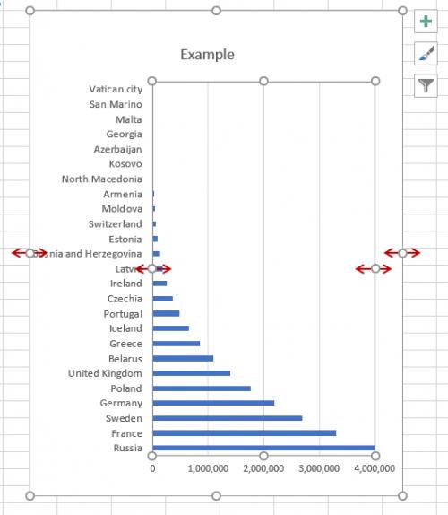
Figure 1.
2020-09-19 11:17:54
Jens
re Excel Tip 8156 Changing Y Axis Label Width - an alternative is to delete the labels on the Chart and post them instead in a worksheet column. Then realign your chart, with chart background set to "No Fill" so that the plot area aligns with the top and bottom of the range of Y-Axis labels on the spreadsheet. This gives you complete flexibility in posting your labels.
Got a version of Excel that uses the ribbon interface (Excel 2007 or later)? This site is for you! If you use an earlier version of Excel, visit our ExcelTips site focusing on the menu interface.
FREE SERVICE: Get tips like this every week in ExcelTips, a free productivity newsletter. Enter your address and click "Subscribe."
Copyright © 2026 Sharon Parq Associates, Inc.
Comments