Please Note: This article is written for users of the following Microsoft Excel versions: 2007, 2010, 2013, 2016, 2019, and 2021. If you are using an earlier version (Excel 2003 or earlier), this tip may not work for you. For a version of this tip written specifically for earlier versions of Excel, click here: Using Dynamic Chart Titles.
There is a very cool way, apparently not well known, of adding 'active' or 'live' titles and other text to charts. In this way you can make a change in a worksheet and have that change reflected in a title in the chart. Follow these steps:
=MySheet!$A$1
That's it. Now, whenever the contents of A1 are changed Excel updates the information in the chart's title.
ExcelTips is your source for cost-effective Microsoft Excel training. This tip (9701) applies to Microsoft Excel 2007, 2010, 2013, 2016, 2019, and 2021. You can find a version of this tip for the older menu interface of Excel here: Using Dynamic Chart Titles.

Dive Deep into Macros! Make Excel do things you thought were impossible, discover techniques you won't find anywhere else, and create powerful automated reports. Bill Jelen and Tracy Syrstad help you instantly visualize information to make it actionable. You�ll find step-by-step instructions, real-world case studies, and 50 workbooks packed with examples and solutions. Check out Microsoft Excel 2019 VBA and Macros today!
Create a chart on its own worksheet, and you can display it by simply clicking the tab at the bottom of the Excel work ...
Discover MoreCreate a chart in Excel, and you may find that the tick marks shown on the axes in the chart aren't to your liking. It is ...
Discover MoreCreating a graphic chart based on your worksheet data is easy. This tip provides a couple of different ways you can start ...
Discover MoreFREE SERVICE: Get tips like this every week in ExcelTips, a free productivity newsletter. Enter your address and click "Subscribe."
2020-08-10 18:41:03
Ronmio
To elaborate on Allen's tip and Dave's suggestion, since Excel only allows a simple "=" pointing to a single cell, you need to get creative in the referenced cell.
[sorry about the duplicates from trying to decipher how to insert an image]
My formulas (hidden behind the graph as Dave suggested) typically use concatenation. For example, by using a couple of helper cells (LargestDate whose formula is =Large(Date,1) and FifthLargestDate whose formula is =Large(Date,5), both also hidden behind the chart), this formula ...
="Daily Volumes (averaging "&AVERAGEIFS(Amount,Date,"<="&LargestDate,Date,">="&FifthLargestDate)&" over the most recent 5 days)"
will produce a dynamic Chart Title (or Axis Name, etc.) that reads like this,
Daily Volumes (averaging 22.6 over the most recent 5 days)
Like Dave, my charts will often contain many expressive chart elements.
Along the same lines, I will add a text box in the chart to create a more expressive "Legend". One big advantage of using a text box within a chart is that you can tailor it extensively (e.g., right clicking on some or all the text to add bullets, condense the line spacing using Paragraph formatting, etc.
(see Figure 1 below)
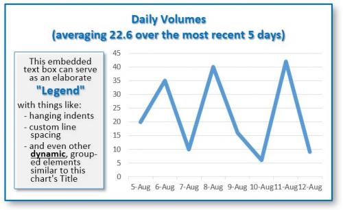
Figure 1.
2020-08-10 11:13:59
Dave
I often skip using Excel's chart and axis titles.
Instead, I use the cells under the chart for these titles.
Why? For more flexibility. I can format the cells any way I want, including coloring some font characters, adding subtitles and all that stuff.
I sometimes even do that for the category axis titles of bar charts. For horizontal bar charts, I use one row for each horizontal bar. For vertical bar charts, I use one column for each vertical bar. It sometimes takes a bit of fiddling, so I save this technique for only where it adds value.
Got a version of Excel that uses the ribbon interface (Excel 2007 or later)? This site is for you! If you use an earlier version of Excel, visit our ExcelTips site focusing on the menu interface.
FREE SERVICE: Get tips like this every week in ExcelTips, a free productivity newsletter. Enter your address and click "Subscribe."
Copyright © 2026 Sharon Parq Associates, Inc.
 Please Note:
This article is written for users of the following Microsoft Excel versions: 2007, 2010, 2013, 2016, 2019, and 2021. If you are using an earlier version (Excel 2003 or earlier), this tip may not work for you. For a version of this tip written specifically for earlier versions of Excel, click here:
Please Note:
This article is written for users of the following Microsoft Excel versions: 2007, 2010, 2013, 2016, 2019, and 2021. If you are using an earlier version (Excel 2003 or earlier), this tip may not work for you. For a version of this tip written specifically for earlier versions of Excel, click here:
Comments