Peter is getting older (aren't we all?) and his vision is getting older along with him. When he creates a chart, Excel uses a light gray tone for axis and grid lines. Peter finds these hard to see with his old eyes, so he wonders if there is a way to change the default for axis and grid lines to black.
The easiest way to handle this is to create your own chart template. Here's the general steps for accomplishing the task:
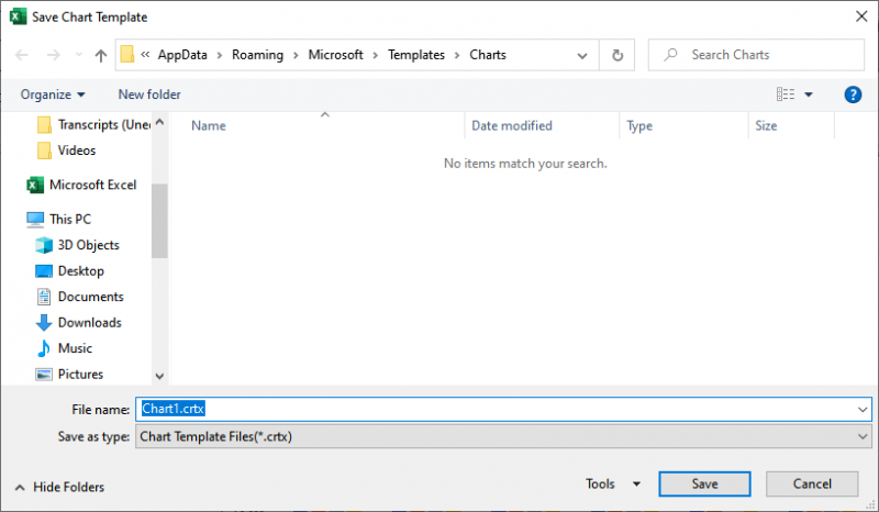
Figure 1. Saving a chart template.
Excel saves the chart type with the template, so if you use different types of charts in your work, you'll want to create a template for each type.
In order to later use the template, all you need to do is to right-click on any chart and, from the resulting Context menu, choose Change Chart Type. Excel then displays the Change Chart Type dialog box. Click Templates at the left side of the dialog box and you can see the template you previously saved, along with any other templates you defined. (See Figure 2.)
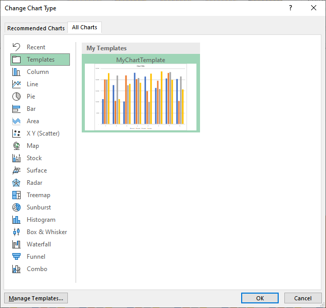
Figure 2. Using a chart template.
When you click on one of the templates and click OK, Excel formats the chart to match the settings in the template.
Interestingly enough, if you use one of your templates disproportionately more often than others, you can set the template as the default chart type. All you need to do, when the Change Chart Type dialog box is displayed, is to right-click on the template you want used as the default and, from the Context menu, choose Set As Default Chart. Now whenever you create a new chart, Excel should rely on the template as the starting point for your chart.
ExcelTips is your source for cost-effective Microsoft Excel training. This tip (10047) applies to Microsoft Excel 2007, 2010, 2013, 2016, 2019, 2021, and Excel in Microsoft 365.

Professional Development Guidance! Four world-class developers offer start-to-finish guidance for building powerful, robust, and secure applications with Excel. The authors show how to consistently make the right design decisions and make the most of Excel's powerful features. Check out Professional Excel Development today!
When formatting a chart, you select elements and then change the properties of those elements until everything looks just ...
Discover MoreWhen sending a chart to someone else, it can be frustrating for the other person to open the workbook and see errors ...
Discover MoreGot a chart created from your worksheet? You can plot times of day in the chart if you apply the simple techniques in ...
Discover MoreFREE SERVICE: Get tips like this every week in ExcelTips, a free productivity newsletter. Enter your address and click "Subscribe."
There are currently no comments for this tip. (Be the first to leave your comment—just use the simple form above!)
Got a version of Excel that uses the ribbon interface (Excel 2007 or later)? This site is for you! If you use an earlier version of Excel, visit our ExcelTips site focusing on the menu interface.
FREE SERVICE: Get tips like this every week in ExcelTips, a free productivity newsletter. Enter your address and click "Subscribe."
Copyright © 2026 Sharon Parq Associates, Inc.
Comments