Hazel has a worksheet consisting of three columns: A contains a start time, B an end time, and C an elapsed time (B-A). She would like to create a graph that illustrates the elapsed times in column C, but she can't seem to get it to work. Hazel wonder is there is a trick to doing this, or if she needs to do some sort of conversion on the elapsed time first.
You should have no problem displaying elapsed time within a chart. The key, however, is to make sure you actually format the column as elapsed time and then specify that you want that time displayed in your chart.
To accomplish the first element, follow these steps:
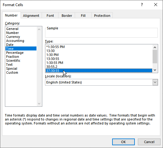
Figure 1. The Format Cells dialog box.
Your column now shows the correct times as elapsed hours, minutes, and seconds. You can now move on to the second element, which is making sure that your elapsed times are displayed in your chart. The easiest way to do this is to simply select a cell in your data, and then press F11. Excel creates a brand-new chart based on your data. If the data is just as Hazel described, this will be a simple column chart. The chart will be unusable, however, because it contains too much data.
To get around this, click the Select Data tool. (This tool is on the Chart Design tab of the ribbon.) Excel displays the Select Data Source dialog box. (See Figure 2.)
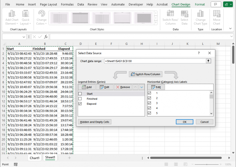
Figure 2. The Select Data Source dialog box.
At the left side of the dialog box there is a very good chance that all of the check boxes are selected because Excel assumed you wanted all of the data charted. Hazel, though, wants only the elapsed time charted. So, clear all of the check boxes at the left side of the dialog box, with the exception of the column that contains your elapsed time. When you click on OK, your chart is refreshed so that it only contains elapsed times along the Y (vertical) axis.
At this point you can change your chart type as desired or format your chart to appear just the way you want.
ExcelTips is your source for cost-effective Microsoft Excel training. This tip (10337) applies to Microsoft Excel 2007, 2010, 2013, 2016, 2019, 2021, and Excel in Microsoft 365.

Create Custom Apps with VBA! Discover how to extend the capabilities of Office 365 applications with VBA programming. Written in clear terms and understandable language, the book includes systematic tutorials and contains both intermediate and advanced content for experienced VB developers. Designed to be comprehensive, the book addresses not just one Office application, but the entire Office suite. Check out Mastering VBA for Microsoft Office 365 today!
Excel makes it easy to copy charts from one workbook to another. Even so, copying may produce some surprising results for ...
Discover MoreNeed a chart that uses two lines for axis labels? It's easy to do if you know how to set up your data in the worksheet, ...
Discover MoreWhen creating a chart based on data in a worksheet, you may want to sort the information in the chart without rearranging ...
Discover MoreFREE SERVICE: Get tips like this every week in ExcelTips, a free productivity newsletter. Enter your address and click "Subscribe."
2023-09-24 05:28:24
Mike J
In Excel 2010, if the Locale in Format cells Time is set to English(UK) then the selection 37:30:55 (i.e. more than 24 hours) is unavailable and time differences over 24 hours are calculated incorrectly. Changing to English(United States) works, but also changes the date format.
However using the Custom Format [h]:mm:ss seems to work with both Locales.
Got a version of Excel that uses the ribbon interface (Excel 2007 or later)? This site is for you! If you use an earlier version of Excel, visit our ExcelTips site focusing on the menu interface.
FREE SERVICE: Get tips like this every week in ExcelTips, a free productivity newsletter. Enter your address and click "Subscribe."
Copyright © 2026 Sharon Parq Associates, Inc.
Comments