Tom has several charts of daily data, and each day he adds more data. On a chart he makes annotations, like arrows or lines referencing certain data points. As new data gets added, the plot shifts to the left in the chart, but the arrows/lines stay in the same place. Thus, they no longer point to where they should. Tom wonders if there is a way to lock the annotation to the actual data point it references.
The short answer is that there is no way to do this in Excel as the program does not allow graphic objects to be anchored to data points. There are, however, ways you can approach the task that may provide the desired results.
One option is to modify how you create the chart. For instance, if you know that your chart will, in the end, cover a month's worth of data, you could provide in your source data dates for each day of the month. Your chart would then generate a data point for each day, even though data for many of the days may be missing. The point is that as you fill in data for future days, when you regenerate the chart, the data won't move to the left because you already have a data point (initially blank) for each date in your chart. Because the data doesn't move, your annotations will still point to the proper places in the chart.
If you are using Excel 2013 or a later version, the most flexible approach is to rely on data labels instead of actually adding annotations using shapes (such as arrows or lines). The way to do this, though, is a bit esoteric.
As an example of how you could use the data labels, let's say you have very simple chart based on two columns of data. (See Figure 1.)
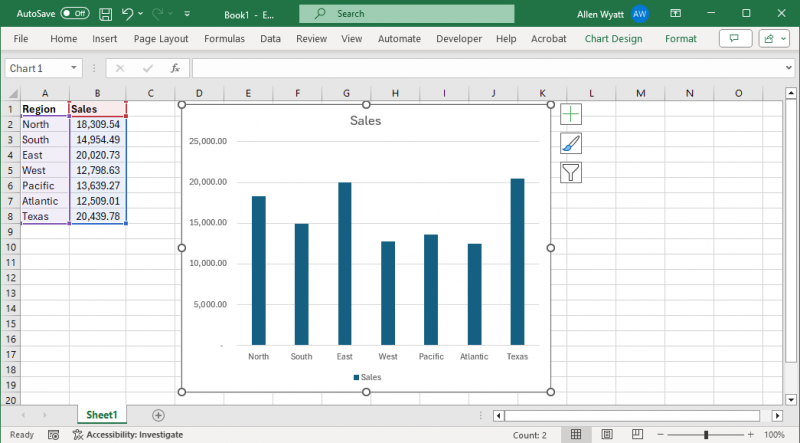
Figure 1. A chart based on some simple data.
You need to add data labels to this chart, so you need to click anywhere in the chart and then display the chart design tab of the ribbon. At the leftmost side of the ribbon, click the Add Chart Element drop-down, hover over the Data Labels option, and finally click on Data Callout. Excel adds the requested data labels to the chart. (See Figure 2.)
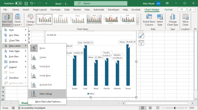
Figure 2. Adding data labels.
The data labels will be rather funky looking, but don't worry about that quite yet. Instead, add a column to the right of your original data. In this example, that would be column C. This column will contain the annotations that you want. (See Figure 3.)
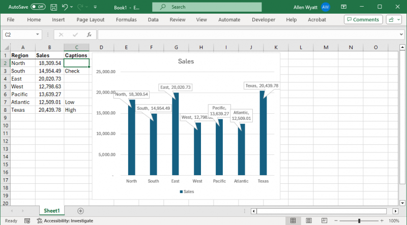
Figure 3. Annotations added to column C.
Next, right-click on one of the funky-looking data labels that you just added to the chart. (It doesn't matter which one.) In the resulting Context menu, hover over the Change Data Labels Shapes option and choose what shape of data label you really want. In this example, I picked the rectangle shape. Next, again right-click on a data label and, from the resulting Context menu, choose Format Data Labels. Excel displays the Format Data Labels task pane at the right of the screen. (See Figure 4.)
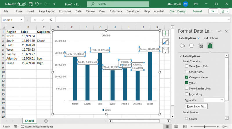
Figure 4. The Format Data Labels task pane.
In the task pane, select the Value from Cells check box. Excel immediately displays a range selection box. All you need to do is to use the mouse to select the range of caption cells you created just a moment ago. In my case, I selected the range C2:C8 and then clicked OK. The data labels in the chart were updated (and they still look quite funky).
Now clear the Category Name and Value check boxes in the task pane. Now your data labels contain only the annotations you placed into column C. (See Figure 5.)
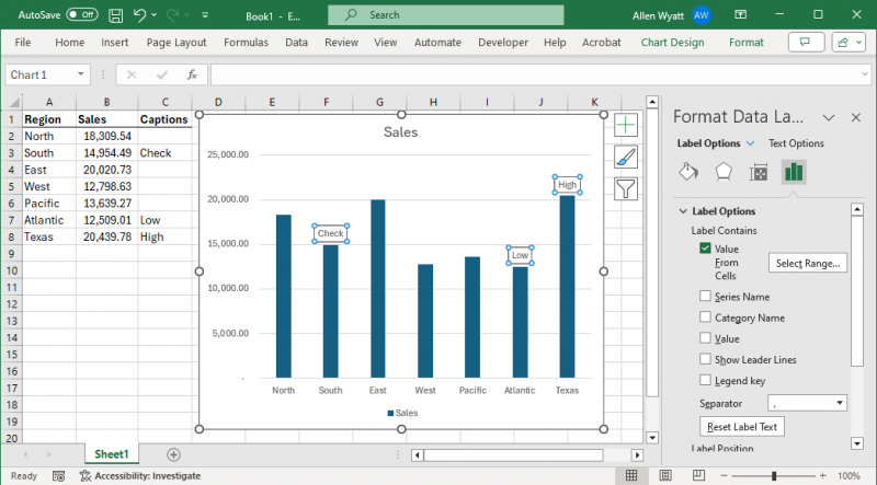
Figure 5. Just the annotation values are now showing in the data labels.
The last step is to select the Show Leader Lines check box in the task pane. This ties a line from the data label to the data point in the chart. This leader line may be visible only if you drag a data label away from its original position, however. (See Figure 6.)
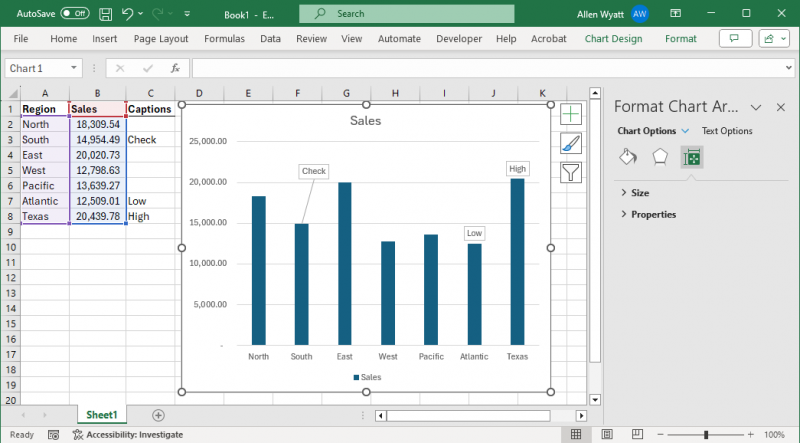
Figure 6. Leader line is visible for the data label for the second data point.
The beauty of using data labels in this way is that they are, literally, anchored to the data points. As you add more data to your chart, the labels remain anchored where you expect them to be.
Another benefit of using data labels is that they can be generated based on formulas. When you added the annotations into column C (in this example), those annotations could have been the result of formulas. Then, as the data updated, the annotations in the chart would have updated, as well.
Finally, if you use data labels to add your annotations, make sure that as you add new data each day to the chart, you also modify the range of cells from which the annotations are pulled. This range is separate from the chart data range, so you'll need to remember to do it as part of your updating process.
ExcelTips is your source for cost-effective Microsoft Excel training. This tip (6072) applies to Microsoft Excel 2007, 2010, 2013, 2016, 2019, 2021, and Excel in Microsoft 365.

Create Custom Apps with VBA! Discover how to extend the capabilities of Office 365 applications with VBA programming. Written in clear terms and understandable language, the book includes systematic tutorials and contains both intermediate and advanced content for experienced VB developers. Designed to be comprehensive, the book addresses not just one Office application, but the entire Office suite. Check out Mastering VBA for Microsoft Office 365 today!
When formatting a chart, you might want to change the characteristics of the font used in various chart elements. This ...
Discover MoreIf you add callouts using the drawing tools in Excel, you may have noticed that they don't always stay where you expect ...
Discover MoreGridlines are often added to charts to help improve the readability of the chart itself. Here's how you can control ...
Discover MoreFREE SERVICE: Get tips like this every week in ExcelTips, a free productivity newsletter. Enter your address and click "Subscribe."
2024-04-13 11:06:19
Ron S
Here are some more "advanced" approaches you can use, in a business setting.
This is an advanced approach, but does not require addons. You combine PowerBI with a PowerApp and online database to store the comment data.
How to Implement Writeback Comments in Power BI Using Power Apps
https://zebrabi.com/writeback-comments-power-bi/
In this post, we'll look at how you can add dynamic writeback comments to your dashboards with Power Apps, allowing users not just to add dynamic comments but also to write back their feedback directly in Power BI. This will require you to have a Microsoft account for using Power Apps.
The number one question we get when doing our webinars is: “Can you talk more about this option of writing the comments back from Power BI?” We heard you and today we’ll explain how you can use Power Apps to do writeback comments in Power BI.
This is a step-by-step tutorial to demonstrate the whole process from a blank Power BI report to a fully functioning solution of write-back commentary.
PowerBI:
An "advanced" solution is to add comments to a PowerBI, which includes PivotCharts which is only supported by "Business" versions of PowerBI
Add comments to a dashboard or report
https://learn.microsoft.com/en-us/power-bi/consumer/end-user-comment
APPLIES TO:
Y: Power BI service for business users
N: Power BI service for designers & developers
N: Power BI Desktop
Y: Requires Pro or Premium license
Add a personal comment or start a conversation about a dashboard or report with your colleagues. The comment feature is just one of the ways a business user can collaborate with others.
There is also an addon tool called "Zebra BI". It includes a feature to add comments to specific data
Zebra BI defines an internationally used reporting standard. One of the elements of that standard includes "dynamic comments"
Actionable Reporting Manifesto: What it is and why we need it? – Zebra BI- 2022 06 16
https://www.youtube.com/watch?v=mCcRkkwogM4 14min
The new reality calls for short action distance.
However, digital transformation can't happen without the adoption by the entire organization.
We present you THE ACTIONABLE REPORTING MANIFESTO.
#5 Add Comments
Comments should add quantitative information to qualitative information. This adds value to reports.
These days it is expected that these coments are dynamic.
If the user clicks on a filter, the comments change to explain the right data categories, directly on the visual, interactively. (Change from P&L to Balance Sheet)
Another addon that includes a comment feature is called InfoRiver
https://inforiver.com/commenting-powerbi/
2024-04-13 09:44:58
Tomek
A slightly different approach can achieve similar effect, without having the captions as additional range in the sheet.
1. Just create your graph with data labels inserted, as per the tip. For the time being, leave one of the choices Value/Category Name/Series name checked , but make sure that the Value from Cells is unchecked (important).
2. Now you can select a Data Label in which you want to put a custom caption (click once on any Data Label, then again on the label you want to modify). Click again on this label to select the text content of this label. Type in your custom caption, overwriting the selected text.
3. Repeat this for all other data labels you want to modify.
4. Once this is complete, in the Format Data Labels panel uncheck the option for Value/Category Name/Series that you left checked in step 1.
After that, only the modified data labels should be visible. You can format each of them individually, as I described in my earlier comment. You can use Show Leader Lines option, and format them as I described in that earlier comment. Alternatively you can use change the shape of the data labels to callouts (also described in my earlier comment).
Examples of this approach: (see Figure 1 below) (see Figure 2 below)
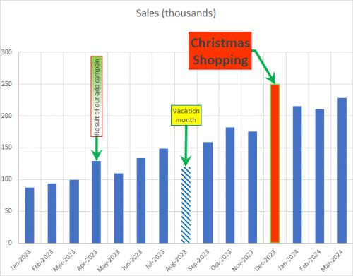
Figure 1. Example Chart with Manually Inserted Captions and Leader Lines
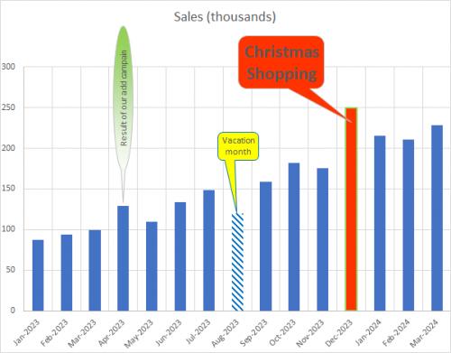
Figure 2. Example Chart with Manually Inserted Captions and Callouts
2024-04-13 09:34:38
Tomek
Once you have your Data Labels set up as per this tip, for more impact you can format the data labels. I suggest to format each of them individually, otherwise the empty labels may show up as placeholders:
- change fill colour/pattern, and border colour/thickness.
- Change size and colour of the font.
- resize the data label.
- data labels can be rotated from -90 to +90°, which may allow to organize them easier and avoid overlapping.
- Instead of using leader lines, you can change the shape of any Data Label to one of the callout shapes (right click on the selected label and chose Change Data Label Shape. Initially, the callouts point to the proper data point, but that can be dragged to another point. However, doing so may cause that pointer to mis-behave when the chart is re-scaled.
You can also add line breaks within the cell with captions. If they are manual line breaks (Alt+<ENTER>) they will be reflected in the Data Label, while wrap text setting will not.
For even more impact, you can change format of individual data points (click the series, then click again on the point (column, bar, point, etc) you want to modify to select it.
If you Show Leader lines you can format those too, but the format applies to all of them. You can select line colour and thickness and the arrow type and size. The beginning arrow is the one that points to the data point. (see Figure 1 below)
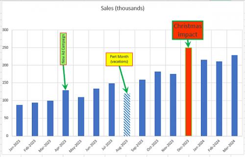
Figure 1. Example Chart with re-formatted Data Point Labels
Got a version of Excel that uses the ribbon interface (Excel 2007 or later)? This site is for you! If you use an earlier version of Excel, visit our ExcelTips site focusing on the menu interface.
FREE SERVICE: Get tips like this every week in ExcelTips, a free productivity newsletter. Enter your address and click "Subscribe."
Copyright © 2026 Sharon Parq Associates, Inc.
Comments