Zoran has a chart with eight XY (scatter) curves. For each curve he defined a plot order. When he adds a legend to the chart, the eight curves are listed in it. However, the order of those eight curves seems to be random. Zoran would like to change the order of entries in the chart legend, but can't find a way how to make such a change.
When you add a legend to a chart, the order in which the legend items appear is dictated by the order in which the data series are charted. For instance, let's suppose you have four data series referred to as North, South, East, and West. If the data series are plotted in this order, then that is the order in which they will appear in the legend from top to bottom (for legends positioned at the left or right of the chart) or from left to right (for legends positioned at the top or bottom of the chart).
The key, then, is to change the order in which your data series are plotted, and then Excel automatically changes the order in which they are displayed in the legend. (If you want the data series to be plotted in an order different from which they appear in the legend, Excel cannot handle that. The legend order is always tied to the data series order.)
To change the data series manually, try this little trick: click one of the data series in your chart. In the Formula bar, you should see something like this:
=SERIES(Sheet1!D$1,Sheet1$A$2:$A$9,Sheet1!$D$2:$D$9,4)
The SERIES function controls what is displayed for this particular data series (the one you selected by clicking). Notice that there are four parameters for the function. The first is the series name, the second is the X range, the third is the Y range, and the fourth is the order in which this particular data series is plotted. Change the fourth parameter and Excel immediately replots your data and updates the order in which items appear in the legend. When you change the parameter, the order parameter for all the other data series are automatically updated, as well.
Another way to change the order of the data series (and thus affect the legend) is to right-click any element of the chart (including the legend) to display a Context menu. Click the Select Data option and Excel displays the Select Data Source dialog box. (See Figure 1.)
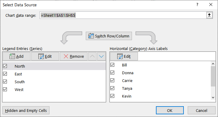
Figure 1. The Select Data Source dialog box.
At the left side of the dialog box you see an area entitled "Legend Entries (Series)." This area details the data series being plotted. You can select one of the entries and use the up and down arrows (just to the right of the Remove button) to adjust the order in which the entries are plotted. When you click OK, the chart is replotted and the legend updated to reflect the plotting order.
ExcelTips is your source for cost-effective Microsoft Excel training. This tip (13214) applies to Microsoft Excel 2007, 2010, 2013, 2016, 2019, and 2021.

Solve Real Business Problems Master business modeling and analysis techniques with Excel and transform data into bottom-line results. This hands-on, scenario-focused guide shows you how to use the latest Excel tools to integrate data from multiple tables. Check out Microsoft Excel Data Analysis and Business Modeling today!
Need to move a chart legend to a different place on the chart? It's easy to do using the mouse, as described in this tip.
Discover MoreWhen you create a chart in Excel, the program may automatically add a legend that explains the contents of the chart. In ...
Discover MoreDisplaying information using charts in Excel is easy and there are a variety of chart styles to choose from. Integrated ...
Discover MoreFREE SERVICE: Get tips like this every week in ExcelTips, a free productivity newsletter. Enter your address and click "Subscribe."
2022-09-17 06:14:16
Alan Stanley
I am having trouble re-ordering a legend and have tried your methods without success. I am pretty sure this is because it is a combo with some series as area format and some as lines The data series are ordered in the worksheet in the sequence required in the legend, and apear in the Select Data Dialog box in the same sequence i.e. the desired sequence, but are re-organised in the legend with the area series promoted to the top.
2021-09-29 08:44:26
Robert Love
I think it is not quite as simple as this. In my experience, in a line chart or an XY scatter chart with two vertical axes, the legend will always list the data series on the secondary axis last. The ordering defined as described in the tip is regarded within each of the two groups of entries in the legend (for data series on the primary and secondary axes respectively) but it is apparently never possible to produce a legend in which entries are mixed together without regard to which vertical axis they use.
2021-03-27 13:38:20
AC
Following the instruction did not make any immediate change, But saving the file and closing, followed by opening again put them in the right order.
2019-07-10 16:04:13
David Levy
Actually it IS possible to change the order of the legend without changing the order of the series. I found that when adding a legend under "Add Chart Element", (this is for a stacked column chart) the legend order matches the series order for the "Top" and "Bottom' legend placement choices. But the order in the legend is reversed if you select either "Left" or "Right" legend placement.
2019-05-21 00:48:02
Anton
Unfortunately, this does not work for stacked bars. When I change the series order, it updates the bars as well as the legend. So I end up with my legend still being the reverse order of my stacked bars
2018-06-09 11:45:36
jaspreet singh Sidhu
When I tried this trick by reorder the listing in the select data menu, it did work within a group of charts which were smooth scatter, not for the ordering of whole groups. In other words, this allows you to move entries with a chart style only. It would be wonderful, if you could please let me know if there is another trick to reorder groups of chart styles, if you have a chart with multiple styles say smooth scatter with straight line style.
2018-05-12 03:40:39
ales
Workaround for this bug:
1) change the type of graph to something else, Bar graph worked for me
2) change the order of data series with any of the method described above, I used Select Data Source dialog
3) switch the type of graph back, in my case it was XY Scatter
4) eventually fix some formatting lost by changing the graph type
2018-05-05 19:11:52
Trevor
Sadly, even though this post is only a month old, none of what you say here matches what I see in my Excel. I guess I just have bad luck. Your site matches many of the others that are out there, but I am just unable to change my legend order, I guess. Maybe it's because I'm using a map display?
2018-04-08 15:46:08
Ruthie A. Ward
To show a column, a line, another column, another line, etc., have you tried splitting the series onto 2 charts (one of columns, one of lines) using the same axis values? You could then order each chart's series in the desired order, stack a chart with a transparent background on top of the other chart, and move the legends up/down so that both legends show as if they were one legend. This method may also work for solving the issue of ordering the legend entries for a chart with mixed chart types.
Another possibility (that's quite a bit of work) is to create a text box with the legend you wish, shapes to portray the series indicators, and layer the shapes on the legend/text box which would then be layered on the chart.
A third option is to use the Camera tool to simulate a legend on your original chart (without the automatic legend showing).
2018-04-06 07:30:41
Billy Thomas
Excellent!
2017-09-01 22:29:55
Tim J.
This tip doesn't work for me as my data is in an Excel Table, not a range. (Thanks for your site anyway.)
2017-01-25 10:30:18
Hamza
Thank you for this. I really didn't know how to do it. Pretty basic, yet extremely useful!
2016-08-26 11:05:08
I have Excel 2010 and the little arrows move the legend entries in the Select Data Source, but they do not change in the chart legend.
How can I get legend to change?
2016-08-23 19:14:38
Rolf Jentoft
I was having a similar problem with a legend not updating after using the arrows on the select data window and clicking OK. This was a graph with primary and secondary data. I closed the file after saving and re-opened it and the legend was correct.
2016-05-24 13:47:57
Kevin Pond
I have tried both methods the chart still plots all primary axis elements and then secondary axis elements regardless of the order I put them in.
2016-05-24 02:25:28
Col Delane
I've tried the approaches described in this tip, but the first series shown in my legend won't budge from pole position!
I'm also NOT able to change the "order" argument in the Series function (I can edit the value in the formula bar, but Excel will not accept my change!)
2016-05-24 01:59:08
Col Delane
Dean, Lester & Jim
I suspect the order is by axis first, then series within the axis group. So if you want the line series to be on top in the legend, try swapping the axis (i.e. L to R, R to L)on which each series is plotted. (I haven't tested this - just an idea)
2016-03-01 16:45:37
Jim Devoe
I'm having the same issue as Dean and Lester. 2 bars, 2 lines, bars are on top of legend despite re-ordering manually, repeatedly.
Is there any fix to this? I'm about to hand draw the legend and paste it as an image over the "real" legend just to work around.
Thanks
2015-04-16 14:22:39
Lester Banks
I have the same problem as Dean. I have a line over stacked columns. I want the line to be the top entry in the legend, but Excel forces it to the bottom of the legend, regardless of how I order the data.
2014-12-23 16:24:08
Dean Barker
Hi Allen, I notice when I have a primary & secondary axis, with both columns and lines plotted, it will not let me re-order. Excel is putting all the columns in the legend first, then the lines after that in the legend. I need to be able to show a column then a line, then a column then a line in my legend, how can I accomplish that ?
2014-08-17 03:58:56
gerdami
However, when you change the order as described in the second part of the article, clicking on the chart no longer shows the range of data used by the chart.
Got a version of Excel that uses the ribbon interface (Excel 2007 or later)? This site is for you! If you use an earlier version of Excel, visit our ExcelTips site focusing on the menu interface.
FREE SERVICE: Get tips like this every week in ExcelTips, a free productivity newsletter. Enter your address and click "Subscribe."
Copyright © 2026 Sharon Parq Associates, Inc.
Comments