Please Note: This article is written for users of the following Microsoft Excel versions: 2007, 2010, 2013, 2016, 2019, and 2021. If you are using an earlier version (Excel 2003 or earlier), this tip may not work for you. For a version of this tip written specifically for earlier versions of Excel, click here: Changing Axis Tick Marks.
If you use an Excel chart type that uses axes, you may have noticed the presence of "tick marks" on one or all of the axes. Tick marks are used to indicate a major or minor demarcation along an axis. For instance, if you have an axis that ranges from 0 to 1000, there may be major tick marks at every 100 in the range, and minor tick marks at every 50.
Excel normally sets up the tick marks for you, but you can change the way they appear by following these steps if you are using Excel 2013 or a later version:
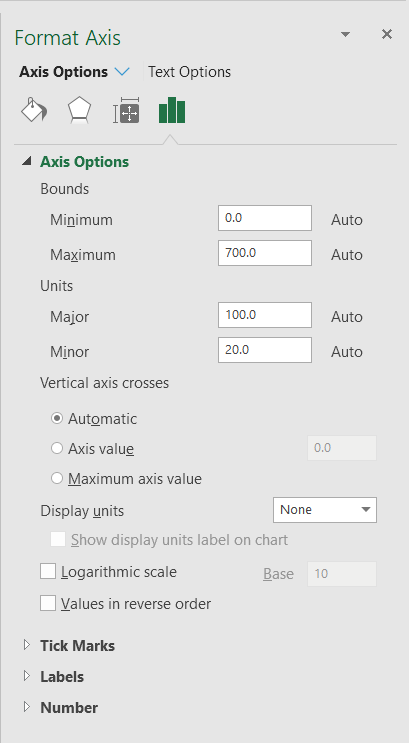
Figure 1. The Axis Options tab of the Format Axis task pane.
The steps in Excel 2007 or Excel 2010 are largely identical, except that you end up working with the Format Axis dialog box instead of the Format Axis task pane. The only difference is that you need to click Fixed before specifying a multiple in Steps 4 and 5.
ExcelTips is your source for cost-effective Microsoft Excel training. This tip (6211) applies to Microsoft Excel 2007, 2010, 2013, 2016, 2019, and 2021. You can find a version of this tip for the older menu interface of Excel here: Changing Axis Tick Marks.
Solve Real Business Problems Master business modeling and analysis techniques with Excel and transform data into bottom-line results. This hands-on, scenario-focused guide shows you how to use the latest Excel tools to integrate data from multiple tables. Check out Microsoft Excel Data Analysis and Business Modeling today!
Do you use Excel's charting capabilities to display three-dimensional views of your data? The program provides a way that ...
Discover MoreExcel can display both values and names for data points in a chart, when you hover the mouse over the data point. This ...
Discover MoreWhen creating a chart from information that contains empty cells, you can direct Excel how it should proceed. This tip ...
Discover MoreFREE SERVICE: Get tips like this every week in ExcelTips, a free productivity newsletter. Enter your address and click "Subscribe."
2022-01-17 10:50:42
Hello Allen,
in my scenario i deal with very odd values and to represente them properly I need to set the lenght of the axis to precise values.
In my example:
X axis: from -2,950 to 2,950
Y axis: from -385,000 to 385,000
Now I'd like to add units an I want something like
X units: 500
Y units: 50.000
I find that Excel sets the lables at -2950 then -2450 then 1950 and so on, so i dont have a unit point at Zero.
How can i tell Excel to always start counting units from Zero instead from the lowest limit?
2021-01-02 09:43:29
adrian
is it possible to change where the major tickmark starts? Say the min bound is 0, but I'd like to start the major axis crosses/tickmarks at 10 ?
Got a version of Excel that uses the ribbon interface (Excel 2007 or later)? This site is for you! If you use an earlier version of Excel, visit our ExcelTips site focusing on the menu interface.
FREE SERVICE: Get tips like this every week in ExcelTips, a free productivity newsletter. Enter your address and click "Subscribe."
Copyright © 2026 Sharon Parq Associates, Inc.
 Please Note:
This article is written for users of the following Microsoft Excel versions: 2007, 2010, 2013, 2016, 2019, and 2021. If you are using an earlier version (Excel 2003 or earlier), this tip may not work for you. For a version of this tip written specifically for earlier versions of Excel, click here:
Please Note:
This article is written for users of the following Microsoft Excel versions: 2007, 2010, 2013, 2016, 2019, and 2021. If you are using an earlier version (Excel 2003 or earlier), this tip may not work for you. For a version of this tip written specifically for earlier versions of Excel, click here:
Comments