Please Note: This article is written for users of the following Microsoft Excel versions: 2007, 2010, and 2013. If you are using an earlier version (Excel 2003 or earlier), this tip may not work for you. For a version of this tip written specifically for earlier versions of Excel, click here: Automatically Creating Charts for Individual Rows in a Data Table.
Written by Allen Wyatt (last updated September 11, 2018)
This tip applies to Excel 2007, 2010, and 2013
David has a worksheet that he uses to track sales by company over a number of months. The company names are in column A and up to fifteen months of sales are in columns B:P. David would like to create a chart that could be dynamically changed to show the sales for a single company from the worksheet.
There are several ways that this can be done; I'll examine three of them in this tip. For the sake of example, let's assume that the worksheet is named MyData, and that the first row contains data headers. The company names are in the range A2:A151, and the sales data for those companies is in B2:P151.
One approach is to use Excel's AutoFilter capabilities. Create your chart as you normally would, making sure that the chart is configured to draw its data series from the rows of the MyData worksheet. You should also place the chart on its own sheet.
Now, select A1 on MyData and apply an AutoFilter. (Display the Data tab of the ribbon and click the Filter tool.) A small drop-down arrow appears at the top of each column. Click the drop-down arrow for column A and select the company you want to view in the chart. Excel redraws the chart to include only the single company.
The only potential drawback to the AutoFilter approach is that each company is considered an independent data series, even though only one of them is displayed in the chart. Because they are independent, each company is charted in a different color. If you want the same charting colors to always be used, then you will need to use one of the other approaches.
Another way to approach the problem is through the use of an "intermediate" data table—one that is created dynamically, pulling only the information you want from the larger data table. The chart is then based on the dynamic intermediate table. Follow these steps:
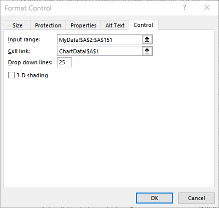
Figure 1. The Format Control dialog box.
=INDEX(MyData!A2:A151,$A$1)
="Data for " & A3
=ChartData!$A$3
You now have a fully functioning dynamic chart. You can use the Combo Box to select a company and the chart is redrawn using the data for the company you select. If you want, you can move or copy the Combo Box to the sheet containing your chart so that you can view the updated chart every time you make a selection. You can also, if desired, hide the ChartData worksheet.
A third approach is to use a macro to modify the range on which a chart is based. To prepare for this approach, create two named ranges in your workbook. The first name should be ChartTitle, and it should refer to the formula =OFFSET(MyData!$A$1,22,0,1,1). The second name should be ChartXRange, and it should refer to the formula =OFFSET(MyData!$A$1,22,0,1,15).
With the names defined, you can select the range MyData!B1:P2 and create your chart. You should base the chart on this simple range, and make sure that you place some temporary text in the chart title. Make sure the chart is created on its own sheet and that you name the sheet ChartSheet.
With the chart created, right-click the chart and choose Select Data. Excel displays the Select Data Source dialog box. Select the data series and click Edit. Excel displays the Edit Series dialog box. Replace whatever is in the Series Values box with the following formula:
='Book1'!ChartXRange
Make sure you replace Book1 with the name of the workbook in which you are working. Click OK, and the chart is now based on the named range you specified earlier. You can now select the chart title and place the following in the Formula bar to make the title dynamic:
=MyData!ChartTitle
Now you are ready to add the macro that makes everything dynamic. Display the VBA Editor and add the following macro to the code window for the MyData worksheet. (Double-click the worksheet name in the Project Explorer area.)
Private Sub Worksheet_BeforeDoubleClick(ByVal Target As Excel.Range, Cancel As Boolean)
    ActiveWorkbook.Names.Add Name:="ChartXRange", _
        RefersToR1C1:="=OFFSET(MyData!R1C1," & _
            ActiveCell.Row - 1 & ",1,1,15)"
    ActiveWorkbook.Names.Add Name:="ChartTitle", _
        RefersToR1C1:="=OFFSET(MyData!R1C1," & _
            ActiveCell.Row - 1 & ",0,1,1)"
    Sheets("ChartSheet").Activate
    Cancel = True
End Sub
Now you can display the MyData worksheet and double-click any row. (Well, double-click in column A for a row.) The macro then updates the named ranges so that they point to the row on which you double-clicked, and then displays the ChartSheet sheet. The chart (and title) are redrawn to reflect the data in the row on which you double-clicked.
ExcelTips is your source for cost-effective Microsoft Excel training. This tip (7887) applies to Microsoft Excel 2007, 2010, and 2013. You can find a version of this tip for the older menu interface of Excel here: Automatically Creating Charts for Individual Rows in a Data Table.
Best-Selling VBA Tutorial for Beginners Take your Excel knowledge to the next level. With a little background in VBA programming, you can go well beyond basic spreadsheets and functions. Use macros to reduce errors, save time, and integrate with other Microsoft applications. Fully updated for the latest version of Office 365. Check out Microsoft 365 Excel VBA Programming For Dummies today!
Excel and Word are intended to work together, but sometimes it can seem that getting them to do so isn't that intuitive. ...
Discover MoreIf you chart data that includes dates along one of the axes, you might be surprised to find out that the chart includes ...
Discover MoreOnce you create a chart, you aren't limited to keeping the data series in the order they originally appeared. You can ...
Discover MoreFREE SERVICE: Get tips like this every week in ExcelTips, a free productivity newsletter. Enter your address and click "Subscribe."
There are currently no comments for this tip. (Be the first to leave your comment—just use the simple form above!)
Got a version of Excel that uses the ribbon interface (Excel 2007 or later)? This site is for you! If you use an earlier version of Excel, visit our ExcelTips site focusing on the menu interface.
FREE SERVICE: Get tips like this every week in ExcelTips, a free productivity newsletter. Enter your address and click "Subscribe."
Copyright © 2025 Sharon Parq Associates, Inc.
 Please Note:
This article is written for users of the following Microsoft Excel versions: 2007, 2010, and 2013. If you are using an earlier version (Excel 2003 or earlier), this tip may not work for you. For a version of this tip written specifically for earlier versions of Excel, click here:
Please Note:
This article is written for users of the following Microsoft Excel versions: 2007, 2010, and 2013. If you are using an earlier version (Excel 2003 or earlier), this tip may not work for you. For a version of this tip written specifically for earlier versions of Excel, click here:
Comments