Please Note: This article is written for users of the following Microsoft Excel versions: 2007, 2010, 2013, 2016, 2019, 2021, 2024, and Excel in Microsoft 365. If you are using an earlier version (Excel 2003 or earlier), this tip may not work for you. For a version of this tip written specifically for earlier versions of Excel, click here: Changing the Axis Scale.
Excel includes an impressive graphing capability that can turn the dullest data into outstanding charts, complete with all sorts of whiz-bang do-dads to amaze your friends and confound your enemies. While Excel can automatically handle many of the mundane tasks associated with turning raw data into a chart, you may still want to change some elements of your chart.
For instance, you may want to change the scale Excel uses along an axis of your chart. (The scale automatically chosen by Excel may not represent the entire universe of possibilities you want conveyed in your chart.) You can change the scale used by Excel by following these steps in Excel 2007 or Excel 2010:

Figure 1. The Axis Options of the Format Axis dialog box.
In Excel 2013 and later versions, the steps are different:
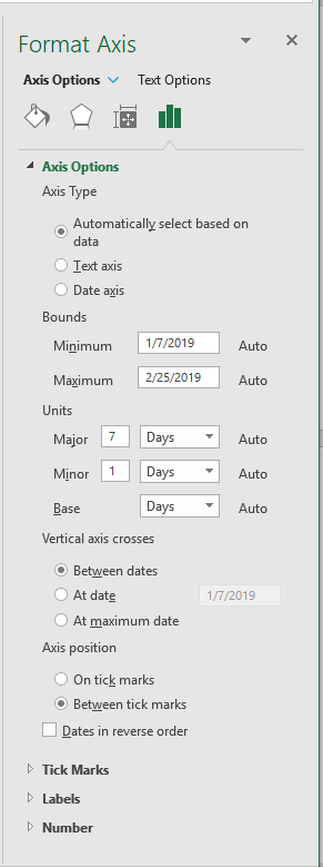
Figure 2. The Axis Options in the Format Axis task pane.
Note that in order to adjust the Bounds and Units settings, Excel needs to recognize the data in an axis as a range of values (e.g. dates). There will not be the option to change Bounds and Units if the data is recognized as discreet values by Excel (e.g. item names).
ExcelTips is your source for cost-effective Microsoft Excel training. This tip (9267) applies to Microsoft Excel 2007, 2010, 2013, 2016, 2019, 2021, 2024, and Excel in Microsoft 365. You can find a version of this tip for the older menu interface of Excel here: Changing the Axis Scale.
Create Custom Apps with VBA! Discover how to extend the capabilities of Office 365 applications with VBA programming. Written in clear terms and understandable language, the book includes systematic tutorials and contains both intermediate and advanced content for experienced VB developers. Designed to be comprehensive, the book addresses not just one Office application, but the entire Office suite. Check out Mastering VBA for Microsoft Office 365 today!
You can spice up your bar chart by using a graphic, of your choosing, to construct the bars. This tip shows how easy it ...
Discover MoreUnhappy with the default size that Excel uses for embedded chart objects? You can't change the size at which they are ...
Discover MoreExcel provides a wide variety of chart types you can use with your data. Unfortunately, this variety can often make it ...
Discover MoreFREE SERVICE: Get tips like this every week in ExcelTips, a free productivity newsletter. Enter your address and click "Subscribe."
2025-07-21 07:52:58
RICK KEEVILL
or use a macro
Sub UpdteAxis()
MinChartNumber = Application.WorksheetFunction.Min(Range("A2").CurrentRegion)'OR USE SELECTION
MaxChartNumber = Application.WorksheetFunction.Max(Range("A2").CurrentRegion)'OR USE SELECTION
For Each cht In ActiveSheet.ChartObjects
cht.Chart.Axes(xlValue).MinimumScale = 0 'or change to MinChartNumber if you don't want 0 as starting point
cht.Chart.Axes(xlValue).MaximumScale = MaxChartNumber
Next
End Sub
Got a version of Excel that uses the ribbon interface (Excel 2007 or later)? This site is for you! If you use an earlier version of Excel, visit our ExcelTips site focusing on the menu interface.
FREE SERVICE: Get tips like this every week in ExcelTips, a free productivity newsletter. Enter your address and click "Subscribe."
Copyright © 2026 Sharon Parq Associates, Inc.
 Please Note:
This article is written for users of the following Microsoft Excel versions: 2007, 2010, 2013, 2016, 2019, 2021, 2024, and Excel in Microsoft 365. If you are using an earlier version (Excel 2003 or earlier), this tip may not work for you. For a version of this tip written specifically for earlier versions of Excel, click here:
Please Note:
This article is written for users of the following Microsoft Excel versions: 2007, 2010, 2013, 2016, 2019, 2021, 2024, and Excel in Microsoft 365. If you are using an earlier version (Excel 2003 or earlier), this tip may not work for you. For a version of this tip written specifically for earlier versions of Excel, click here:
Comments