Please Note: This article is written for users of the following Microsoft Excel versions: 2007, 2010, 2013, 2016, 2019, 2021, and Excel in Microsoft 365. If you are using an earlier version (Excel 2003 or earlier), this tip may not work for you. For a version of this tip written specifically for earlier versions of Excel, click here: Adjusting Your View of 3-D Graphs.
Excel allows you to create some great looking three-dimensional graphs based on the information in your worksheets. For many purposes, the default method in which the graphs are created will be sufficient for your needs. However, you may want to adjust the angle at which you view your graph. Excel makes this easy by following these steps, providing you are using Excel 2013 or a later version of the program:
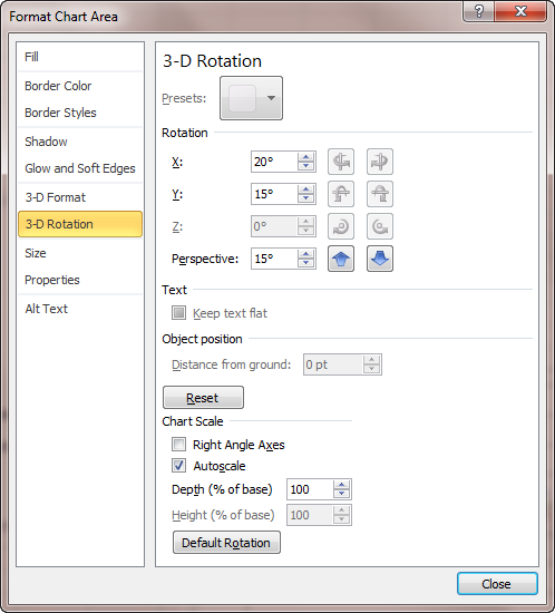
Figure 1. The 3-D Rotation settings of the Format Chart Area task pane.
If you are using Excel 2007 or Excel 2010, then the steps are a bit different:
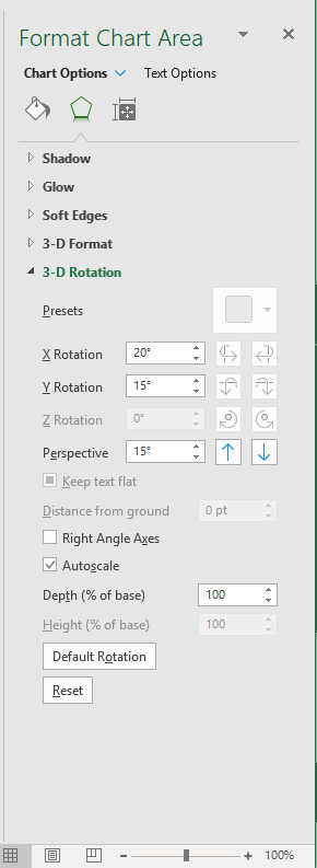
Figure 2. The 3-D Rotation options of the Format Chart Area dialog box.
ExcelTips is your source for cost-effective Microsoft Excel training. This tip (9838) applies to Microsoft Excel 2007, 2010, 2013, 2016, 2019, 2021, and Excel in Microsoft 365. You can find a version of this tip for the older menu interface of Excel here: Adjusting Your View of 3-D Graphs.
Program Successfully in Excel! This guide will provide you with all the information you need to automate any task in Excel and save time and effort. Learn how to extend Excel's functionality with VBA to create solutions not possible with the standard features. Includes latest information for Excel 2024 and Microsoft 365. Check out Mastering Excel VBA Programming today!
When creating a chart, your axis labels may be wider than desired. One way to deal with them is to change the angle at ...
Discover MoreCharts can either be embedded in a worksheet or take up an entire sheet by themselves. Changing from one type of chart to ...
Discover MoreAdding labels to a chart can make the information presented in the chart more understandable. Excel allows you to add ...
Discover MoreFREE SERVICE: Get tips like this every week in ExcelTips, a free productivity newsletter. Enter your address and click "Subscribe."
There are currently no comments for this tip. (Be the first to leave your comment—just use the simple form above!)
Got a version of Excel that uses the ribbon interface (Excel 2007 or later)? This site is for you! If you use an earlier version of Excel, visit our ExcelTips site focusing on the menu interface.
FREE SERVICE: Get tips like this every week in ExcelTips, a free productivity newsletter. Enter your address and click "Subscribe."
Copyright © 2026 Sharon Parq Associates, Inc.
 Please Note:
This article is written for users of the following Microsoft Excel versions: 2007, 2010, 2013, 2016, 2019, 2021, and Excel in Microsoft 365. If you are using an earlier version (Excel 2003 or earlier), this tip may not work for you. For a version of this tip written specifically for earlier versions of Excel, click here:
Please Note:
This article is written for users of the following Microsoft Excel versions: 2007, 2010, 2013, 2016, 2019, 2021, and Excel in Microsoft 365. If you are using an earlier version (Excel 2003 or earlier), this tip may not work for you. For a version of this tip written specifically for earlier versions of Excel, click here:
Comments