Please Note: This article is written for users of the following Microsoft Excel versions: 2007, 2010, 2013, 2016, 2019, and 2021. If you are using an earlier version (Excel 2003 or earlier), this tip may not work for you. For a version of this tip written specifically for earlier versions of Excel, click here: Creating Venn Diagrams with Excel Data.
Stuart wonders if there is a way to create Venn diagrams in Excel. He couldn't find it as a charting option in the program but wondered if there was a possible workaround so that the Venn diagram works directly off data within a worksheet.
A Venn diagram is a type of chart that is often used in set theory—it shows different sets of data and how they relate to each other through intersecting portions of circles. A quick check in the types of charts that Excel can create shows Stuart is correct—there is no choice for creating a Venn diagram.
You can, however, approximate a Venn diagram using the tools that Excel provides. If you aren't too interested in accuracy, you can use the drawing tools in the program to draw circles, size and format them the way you want, and then overlap them as appropriate. You can then add text to the drawing to label the different parts of the diagram.
A more accurate representation can be gained by using a bubble chart (one of the chart types that Excel does provide) to graph the areas. All you need to do is calculate the data points that represent the center of each circle and that circle's size. For instance, you might end up with something like this for three circles in the diagram:
| X-axis | Y-axis | Size | ||
|---|---|---|---|---|
| 5.00 | 7.00 | 90 | ||
| 6.45 | 5.50 | 120 | ||
| 5.00 | 5.00 | 77 |
How you get your data into a format that is appropriate for a bubble chart depends (of course) on the characteristics of your data.
Finally, you can rely on the Smart Art capabilities of Excel. Follow these steps:
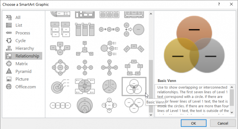
Figure 1. The Choose a SmartArt Graphic dialog box.
Additional information on creating a Venn diagram using SmartArt can be found at this Microsoft site:
http://go.tips.net/venn
You should realize that creating a Venn diagram using SmartArt is very similar to creating one by using the drawing tools available in Excel. Either way, the sizes and position of the circles is not based on data in your worksheet. Instead, they are only approximations based upon how you choose to draw the elements.
ExcelTips is your source for cost-effective Microsoft Excel training. This tip (10844) applies to Microsoft Excel 2007, 2010, 2013, 2016, 2019, and 2021. You can find a version of this tip for the older menu interface of Excel here: Creating Venn Diagrams with Excel Data.
Program Successfully in Excel! This guide will provide you with all the information you need to automate any task in Excel and save time and effort. Learn how to extend Excel's functionality with VBA to create solutions not possible with the standard features. Includes latest information for Excel 2024 and Microsoft 365. Check out Mastering Excel VBA Programming today!
If you want to include a large number of images in your worksheet, you may also want a way to automatically add those ...
Discover MoreThe WordArt program has been available in Office for a long, long time. It allows you to (as the name implies) create art ...
Discover MoreIf you use Excel's graphic capabilities to insert a line or an arrow into a worksheet, you can change how that arrow ...
Discover MoreFREE SERVICE: Get tips like this every week in ExcelTips, a free productivity newsletter. Enter your address and click "Subscribe."
There are currently no comments for this tip. (Be the first to leave your comment—just use the simple form above!)
Got a version of Excel that uses the ribbon interface (Excel 2007 or later)? This site is for you! If you use an earlier version of Excel, visit our ExcelTips site focusing on the menu interface.
FREE SERVICE: Get tips like this every week in ExcelTips, a free productivity newsletter. Enter your address and click "Subscribe."
Copyright © 2026 Sharon Parq Associates, Inc.
 Please Note:
This article is written for users of the following Microsoft Excel versions: 2007, 2010, 2013, 2016, 2019, and 2021. If you are using an earlier version (Excel 2003 or earlier), this tip may not work for you. For a version of this tip written specifically for earlier versions of Excel, click here:
Please Note:
This article is written for users of the following Microsoft Excel versions: 2007, 2010, 2013, 2016, 2019, and 2021. If you are using an earlier version (Excel 2003 or earlier), this tip may not work for you. For a version of this tip written specifically for earlier versions of Excel, click here:
Comments