Please Note: This article is written for users of the following Microsoft Excel versions: 2007, 2010, 2013, 2016, 2019, and 2021. If you are using an earlier version (Excel 2003 or earlier), this tip may not work for you. For a version of this tip written specifically for earlier versions of Excel, click here: Formatting Axis Patterns.
Written by Allen Wyatt (last updated June 2, 2023)
This tip applies to Excel 2007, 2010, 2013, 2016, 2019, and 2021
Most people who create charts with Excel don't know that you can change just about everything that controls how the chart appears. One of the things you can easily change is the pattern used to denote a chart's axis. By default, Excel normally uses a solid line for an axis. If you want to change the pattern used by Excel, follow these steps if you are using Excel 2007 or Excel 2010:
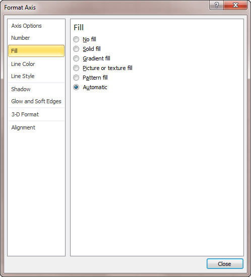
Figure 1. The Format Axis dialog box.
If you are using Excel 2013 or a later version, then the steps are slightly different:
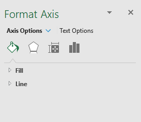
Figure 2. The Format Axis task pane.
ExcelTips is your source for cost-effective Microsoft Excel training. This tip (6134) applies to Microsoft Excel 2007, 2010, 2013, 2016, 2019, and 2021. You can find a version of this tip for the older menu interface of Excel here: Formatting Axis Patterns.
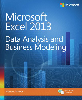
Solve Real Business Problems Master business modeling and analysis techniques with Excel and transform data into bottom-line results. This hands-on, scenario-focused guide shows you how to use the latest Excel tools to integrate data from multiple tables. Check out Microsoft Excel 2013 Data Analysis and Business Modeling today!
When creating a line cart, the line can show values both positive and negative values. This tip explains how you can use ...
Discover MoreDo you use Excel's charting capabilities to display three-dimensional views of your data? The program provides a way that ...
Discover MoreWhen formatting a chart, you might want to change the characteristics of the font used in various chart elements. This ...
Discover MoreFREE SERVICE: Get tips like this every week in ExcelTips, a free productivity newsletter. Enter your address and click "Subscribe."
There are currently no comments for this tip. (Be the first to leave your comment—just use the simple form above!)
Got a version of Excel that uses the ribbon interface (Excel 2007 or later)? This site is for you! If you use an earlier version of Excel, visit our ExcelTips site focusing on the menu interface.
FREE SERVICE: Get tips like this every week in ExcelTips, a free productivity newsletter. Enter your address and click "Subscribe."
Copyright © 2025 Sharon Parq Associates, Inc.
 Please Note:
This article is written for users of the following Microsoft Excel versions: 2007, 2010, 2013, 2016, 2019, and 2021. If you are using an earlier version (Excel 2003 or earlier), this tip may not work for you. For a version of this tip written specifically for earlier versions of Excel, click here:
Please Note:
This article is written for users of the following Microsoft Excel versions: 2007, 2010, 2013, 2016, 2019, and 2021. If you are using an earlier version (Excel 2003 or earlier), this tip may not work for you. For a version of this tip written specifically for earlier versions of Excel, click here:
Comments