Most people who create charts with Excel don't know that you can change just about everything that controls how the chart appears. One of the things you can easily change is the pattern used to denote a chart's axis. By default, Excel normally uses a solid line for an axis. If you want to change the pattern used by Excel, follow these steps:
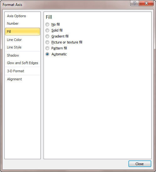
Figure 1. The Format Axis task pane.
If you are using if you are using Excel 2007 or Excel 2010, then the steps are slightly different:
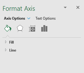
Figure 2. The Format Axis dialog box.
ExcelTips is your source for cost-effective Microsoft Excel training. This tip (6134) applies to Microsoft Excel 2007, 2010, 2013, 2016, 2019, 2021, 2024, and Excel in Microsoft 365.

Professional Development Guidance! Four world-class developers offer start-to-finish guidance for building powerful, robust, and secure applications with Excel. The authors show how to consistently make the right design decisions and make the most of Excel's powerful features. Check out Professional Excel Development today!
Excel is an excellent tool for keeping track of data over time. If you have information you are keeping by year, you may ...
Discover MoreNeed to change the color of different parts of your chart? It's easy to do when you apply the technique described in this ...
Discover MoreWhen creating a chart based on data in a worksheet, you may want to sort the information in the chart without rearranging ...
Discover MoreFREE SERVICE: Get tips like this every week in ExcelTips, a free productivity newsletter. Enter your address and click "Subscribe."
There are currently no comments for this tip. (Be the first to leave your comment—just use the simple form above!)
Got a version of Excel that uses the ribbon interface (Excel 2007 or later)? This site is for you! If you use an earlier version of Excel, visit our ExcelTips site focusing on the menu interface.
FREE SERVICE: Get tips like this every week in ExcelTips, a free productivity newsletter. Enter your address and click "Subscribe."
Copyright © 2026 Sharon Parq Associates, Inc.
Comments