Please Note: This article is written for users of the following Microsoft Excel versions: 2007, 2010, 2013, 2016, 2019, 2021, 2024, and Excel in Microsoft 365. If you are using an earlier version (Excel 2003 or earlier), this tip may not work for you. For a version of this tip written specifically for earlier versions of Excel, click here: Excel Charts in PowerPoint.
If you do a lot of presentations, you may deal with many large data reports that include charts and graphs that summarize data for your audiences. Sometimes you may need to add these charts and graphs to PowerPoint presentations.
The problem with doing a simple copy and paste of a chart from Excel to PowerPoint is that although you only see the chart in the PowerPoint slide, the entire workbook is copied into PowerPoint as well. If someone double-clicks the chart in the slide, PowerPoint will open the entire Excel workbook.
This poses a couple of problems. First, unless the PowerPoint file has been password protected (not really an option for mass distribution) a user could easily adjust the data feeding into the chart and corrupt accuracy.
Secondly, since the entire Excel workbook is copied into the PowerPoint file, this can dramatically increase the total size on the PowerPoint file, possibly making it too cumbersome for distribution.
One simple solution is to modify how the pasting into PowerPoint is done. Follow these steps:
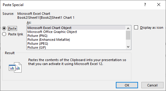
Figure 1. The Paste Special dialog box in PowerPoint.
This time, only the image of the chart is pasted into the slide. This maintains the accuracy and security of your chart and significantly reduces the size of your PowerPoint presentation.
ExcelTips is your source for cost-effective Microsoft Excel training. This tip (13109) applies to Microsoft Excel 2007, 2010, 2013, 2016, 2019, 2021, 2024, and Excel in Microsoft 365. You can find a version of this tip for the older menu interface of Excel here: Excel Charts in PowerPoint.

Dive Deep into Macros! Make Excel do things you thought were impossible, discover techniques you won't find anywhere else, and create powerful automated reports. Bill Jelen and Tracy Syrstad help you instantly visualize information to make it actionable. You�ll find step-by-step instructions, real-world case studies, and 50 workbooks packed with examples and solutions. Check out Microsoft Excel 2019 VBA and Macros today!
Got a bunch of charts that you need to make formatting changes in? You can use a macro (or two) to apply the formatting ...
Discover MoreWouldn't it be great to have your huge charts print out on multiple pieces of paper that you could then piece together? ...
Discover MorePie charts are a great way to graphically display some types of data. Displaying negative values is not so great in pie ...
Discover MoreFREE SERVICE: Get tips like this every week in ExcelTips, a free productivity newsletter. Enter your address and click "Subscribe."
There are currently no comments for this tip. (Be the first to leave your comment—just use the simple form above!)
Got a version of Excel that uses the ribbon interface (Excel 2007 or later)? This site is for you! If you use an earlier version of Excel, visit our ExcelTips site focusing on the menu interface.
FREE SERVICE: Get tips like this every week in ExcelTips, a free productivity newsletter. Enter your address and click "Subscribe."
Copyright © 2026 Sharon Parq Associates, Inc.
 Please Note:
This article is written for users of the following Microsoft Excel versions: 2007, 2010, 2013, 2016, 2019, 2021, 2024, and Excel in Microsoft 365. If you are using an earlier version (Excel 2003 or earlier), this tip may not work for you. For a version of this tip written specifically for earlier versions of Excel, click here:
Please Note:
This article is written for users of the following Microsoft Excel versions: 2007, 2010, 2013, 2016, 2019, 2021, 2024, and Excel in Microsoft 365. If you are using an earlier version (Excel 2003 or earlier), this tip may not work for you. For a version of this tip written specifically for earlier versions of Excel, click here:
Comments