Please Note: This article is written for users of the following Microsoft Excel versions: 2007, 2010, 2013, 2016, 2019, and 2021. If you are using an earlier version (Excel 2003 or earlier), this tip may not work for you. For a version of this tip written specifically for earlier versions of Excel, click here: Creating an Organization Chart.
Written by Allen Wyatt (last updated June 12, 2024)
This tip applies to Excel 2007, 2010, 2013, 2016, 2019, and 2021
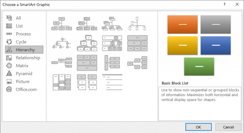
One of the tools available in Excel is the ability to create organization charts. How you create one depends on the version of Excel you are using. Start by displaying the Insert tab of the ribbon. In the Illustrations group, click the SmartArt tool. Excel displays the Choose a SmartArt Graphic dialog box. At the left of the dialog box click Hierarchy to see the types of organization charts available. (See Figure 1.)

Figure 1. The Choose a SmartArt Graphic dialog box.
If you are using Excel 2007 there are seven types of hierarchy charts available. In Excel 2010 and later versions the number is fifteen. Regardless of the version you are using, the first type of hierarchy chart available is the traditional organization chart. Click that chart (or one of the others, if you prefer) and click OK. Excel adds the chart to your worksheet, along with a bunch of different tools on the Design and Format tabs of the ribbon.
Organization charts are made up of shapes and lines. Lines are automatically added or removed as you add or remove shapes. If you would like to change the formatting of any of the elements in the organization chart, right-click on the element and choose Format Shape from the Context menu.
ExcelTips is your source for cost-effective Microsoft Excel training. This tip (6118) applies to Microsoft Excel 2007, 2010, 2013, 2016, 2019, and 2021. You can find a version of this tip for the older menu interface of Excel here: Creating an Organization Chart.

Best-Selling VBA Tutorial for Beginners Take your Excel knowledge to the next level. With a little background in VBA programming, you can go well beyond basic spreadsheets and functions. Use macros to reduce errors, save time, and integrate with other Microsoft applications. Fully updated for the latest version of Office 365. Check out Microsoft 365 Excel VBA Programming For Dummies today!
Worksheets can contain more than just text and numbers. Here's the low-down on the different types of pictures you can ...
Discover MoreIf you use Excel to keep a graphic with each row of data you amass, you may wonder if there is a way to easily delete the ...
Discover MoreNeed to make sure that someone cannot delete a graphic in a worksheet? The ability to protect the graphic depends on ...
Discover MoreFREE SERVICE: Get tips like this every week in ExcelTips, a free productivity newsletter. Enter your address and click "Subscribe."
There are currently no comments for this tip. (Be the first to leave your comment—just use the simple form above!)
Got a version of Excel that uses the ribbon interface (Excel 2007 or later)? This site is for you! If you use an earlier version of Excel, visit our ExcelTips site focusing on the menu interface.
FREE SERVICE: Get tips like this every week in ExcelTips, a free productivity newsletter. Enter your address and click "Subscribe."
Copyright © 2026 Sharon Parq Associates, Inc.
Comments