Scott has a set of data by date that is used for a graph. The data is entered by date which only reflects weekdays. (The data contains no entries for weekends.) When Scott graphs the data using the dates as the horizontal axis, Excel inserts the weekend dates with no data points. These dates are not in the original data and he cannot seem to get rid of them so that only the data in the table is shown in the chart.
Believe it or not, this behavior is by design. When you convert your data into a chart, Excel tries to make sense of the data it is charting. If it determines that the data in a particular column or row represents dates, it looks at the earliest date in the range and the latest date in the range and then uses that as the range for the axis. That means that it includes data points in the range that may not really exist in the original data—such as the weekends that Scott mentions.
The solution to this is to overcome the automatic parsing done by Excel as it converts the data in your worksheet into a chart. There are a few ways you can do this. First of all, you can convert your original dates into text values. (Excel doesn't recognize text values as dates, and therefore doesn't do the whole earliest-to-latest range thing.) You could do this by actually converting the date column or row into text or by adding a helper column or row that contains the dates as text representations. If you decide to go the helper route, you could use a formula such as the following:
=TEXT(A1,"m/d/yy")
You could, of course, change the formatting pattern for the date to anything you want, as described in other ExcelTips. You would then use the helper column or row as your axis data in the chart. Excel recognizes it as text and includes only the datapoints in the worksheet—no more phantom weekends!
Interestingly enough, you can also fool Excel in its parsing by simply converting a single cell in the date column into a text value. It appears that if the entire row or column doesn't contain dates, Excel no longer applies the date-range parsing when putting together the chart.
If you don't want to modify your original data, you can simply tell Excel to ignore the date parsing. Follow these steps if you are using Excel 2007 or Excel 2010:
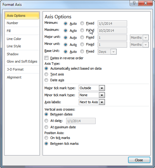
Figure 1. The Axis Options of the Format Axis dialog box.
If you are using Excel 2013 or a later version, then the steps are a bit different:
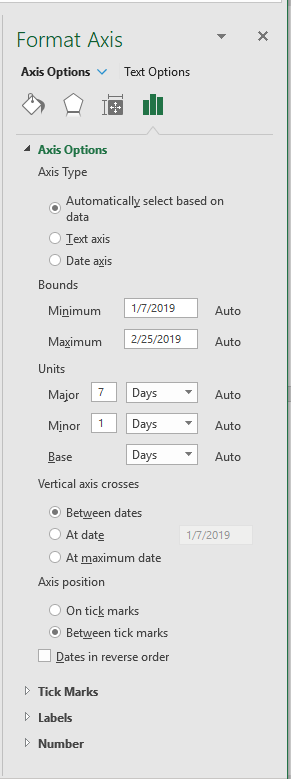
Figure 2. The Axis Options on the Format Axis task pane.
At this point, Excel should redraw your chart and treat your dates as text values, even though they really are dates. This means that you won't get any phantom dates in the date range displayed in the chart. In addition, the dates on the axis should be displayed exactly as they appear in the worksheet data. Thus, if you want to change the way the dates are displayed in the chart, you'll need to reformat your source data for the desired appearance.
You should note that your ability to modify the Axis Type setting depends on the type of chart you are creating. If the chart doesn't have an axis (such as a pie chart) or the chart is primarily for plotting numbers (such as with an XY chart), then you may not be able to tell Excel to treat the axis as text. Why? Because doing so makes no sense in the case of those types of charts.
ExcelTips is your source for cost-effective Microsoft Excel training. This tip (13271) applies to Microsoft Excel 2007, 2010, 2013, 2016, 2019, and 2021.

Solve Real Business Problems Master business modeling and analysis techniques with Excel and transform data into bottom-line results. This hands-on, scenario-focused guide shows you how to use the latest Excel tools to integrate data from multiple tables. Check out Microsoft Excel Data Analysis and Business Modeling today!
It can be frustrating when Excel doesn't display the formatting options that you know it should for your charts. This tip ...
Discover MoreMost charts you create in Excel are based on information stored in a worksheet. You can also create charts based on ...
Discover MoreWhen creating a line cart, the line can show values both positive and negative values. This tip explains how you can use ...
Discover MoreFREE SERVICE: Get tips like this every week in ExcelTips, a free productivity newsletter. Enter your address and click "Subscribe."
2022-04-19 15:30:24
Pete
Hi Allen. Thanks for your tips. Your face has become familiar to me over the years thanks to google search and your answers are always clear and to the point.
2020-12-18 21:05:21
Allen
It is still there, Michael.
-Allen
2020-12-18 16:38:47
Michael Angelo MUSTILLO
In Excel 365 Axis Type doesn't appear any more, so that option seems to be dead!
Got a version of Excel that uses the ribbon interface (Excel 2007 or later)? This site is for you! If you use an earlier version of Excel, visit our ExcelTips site focusing on the menu interface.
FREE SERVICE: Get tips like this every week in ExcelTips, a free productivity newsletter. Enter your address and click "Subscribe."
Copyright © 2026 Sharon Parq Associates, Inc.
Comments