Written by Allen Wyatt (last updated September 9, 2023)
This tip applies to Excel 2007, 2010, 2013, 2016, 2019, 2021, and Excel in Microsoft 365
Michael wonders if there is a way to format axis labels on his charts so that they are at an angle when compared to the actual axis line. He would like his axis labels to be at an approximate 45-degree angle.
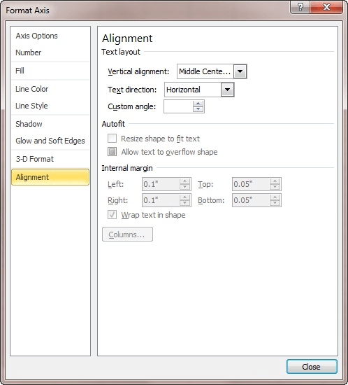
How you go about adjusting the angle depends on the version of Excel you are using. If you are using Excel 2007 or Excel 2010, follow these steps:

Figure 1. The Format Axis dialog box.
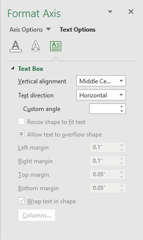
If you are using Excel 2013 or a later version, the steps are just a bit different. (They are largely different because Microsoft did away with the Format Axis dialog box, choosing instead to use a task pane.)

Figure 2. The Text Box options in the Format Axis task pane.
Your changes should be immediately reflected in the axis labels.
There is one potential gotcha here—if is possible that you may want to set the angle for the axis label, but you discover that the Custom Angle control is grayed out. If this is the case, check to make sure that the Text Direction drop-down list is set to Horizontal. Any other setting here, and you won't be able to specify an angle.
ExcelTips is your source for cost-effective Microsoft Excel training. This tip (5139) applies to Microsoft Excel 2007, 2010, 2013, 2016, 2019, 2021, and Excel in Microsoft 365.

Program Successfully in Excel! This guide will provide you with all the information you need to automate any task in Excel and save time and effort. Learn how to extend Excel's functionality with VBA to create solutions not possible with the standard features. Includes latest information for Excel 2024 and Microsoft 365. Check out Mastering Excel VBA Programming today!
Excel provides a wide variety of chart types you can use with your data. Unfortunately, this variety can often make it ...
Discover MoreExcel allows you to add all sorts of objects to your worksheets. Among the objects you can add are text boxes, shapes, ...
Discover MoreA common place to use Excel charts is in your PowerPoint presentations. How you paste those charts into the presentation ...
Discover MoreFREE SERVICE: Get tips like this every week in ExcelTips, a free productivity newsletter. Enter your address and click "Subscribe."
2023-09-10 00:29:28
Sandy
Thanks for this tip.
I have regularly used angle adjustment in the past, but spent a fruitless hour looking for the current hiding spot yesterday. perfect timing!
Got a version of Excel that uses the ribbon interface (Excel 2007 or later)? This site is for you! If you use an earlier version of Excel, visit our ExcelTips site focusing on the menu interface.
FREE SERVICE: Get tips like this every week in ExcelTips, a free productivity newsletter. Enter your address and click "Subscribe."
Copyright © 2026 Sharon Parq Associates, Inc.
Comments